

Illustration · Identity · Typesetting · Print production · Art direction · Wayfinding · Apparel & merch design
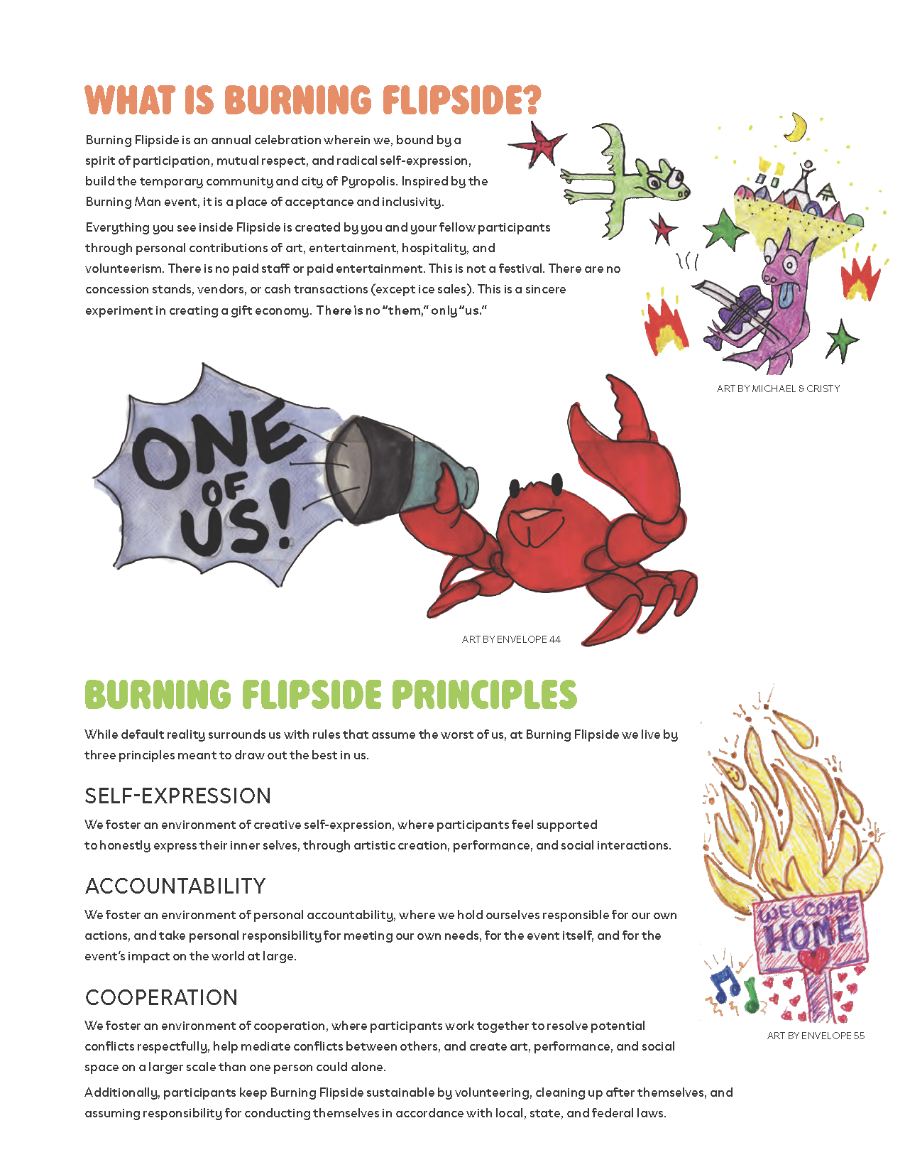
What’s a burn?
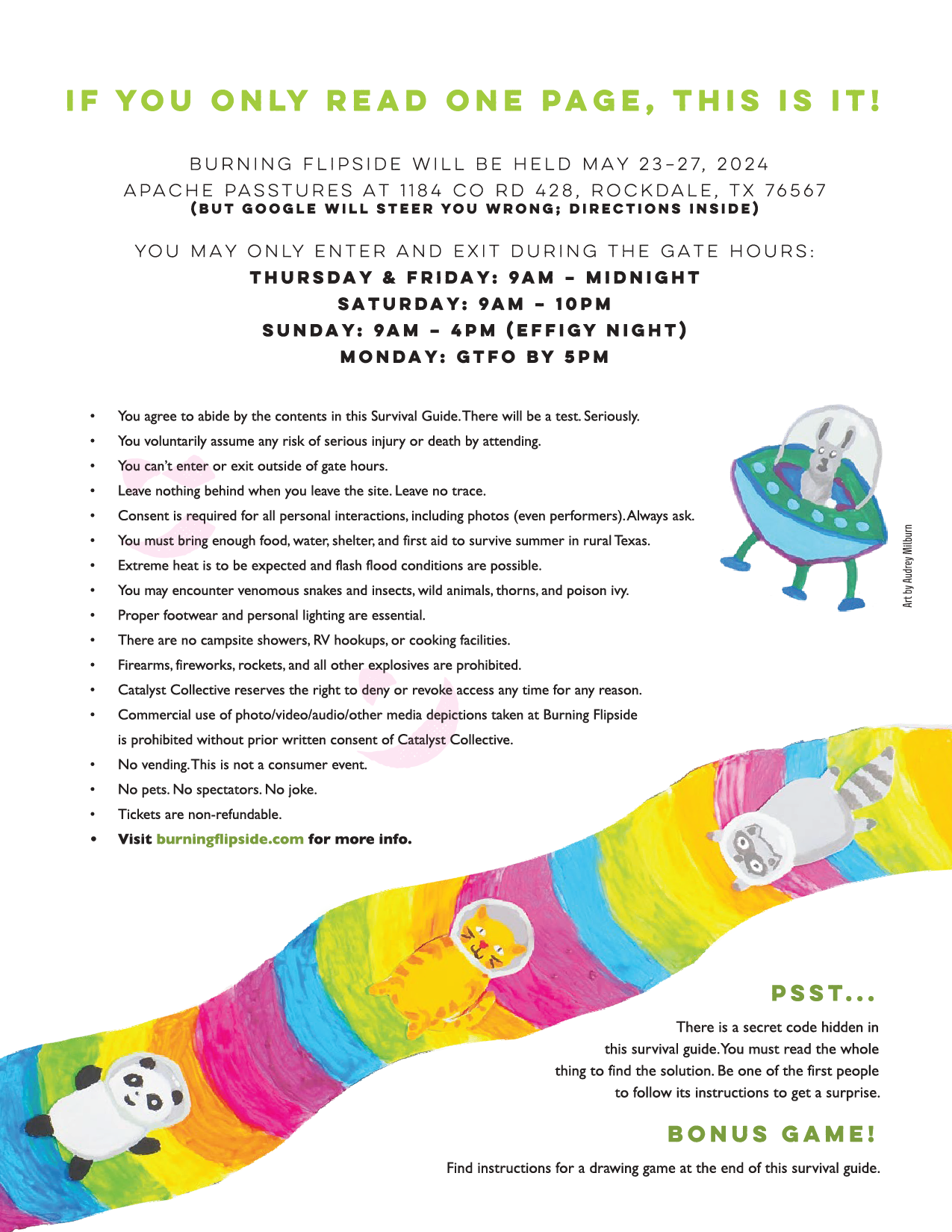
A burn is a temporary, volunteer-run city built on radical self-expression. Burns can be found year-round in over 30 countries, with the most notable being Burning Man.
Each one has its own theme, culture, and identity, and since the theme changes every year, the brand starts from zero every single time. That constraint is the brief.
My role
I serve as Lead Graphic Artist and Survival Guide Designer for Burning Flipside, the largest US regional burn which brings in over 2,000 people, and have produced work for additional Texas burns, including FreezerBurn and Myschievia.
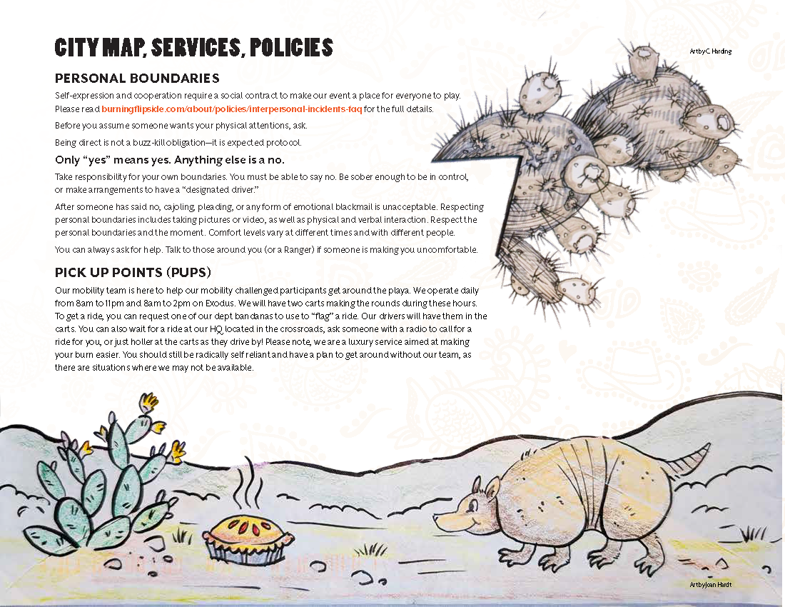
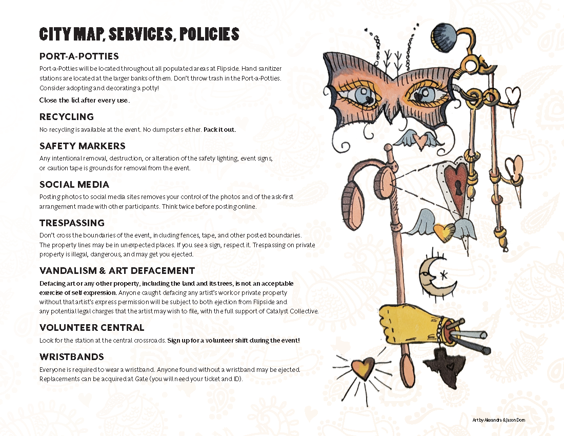
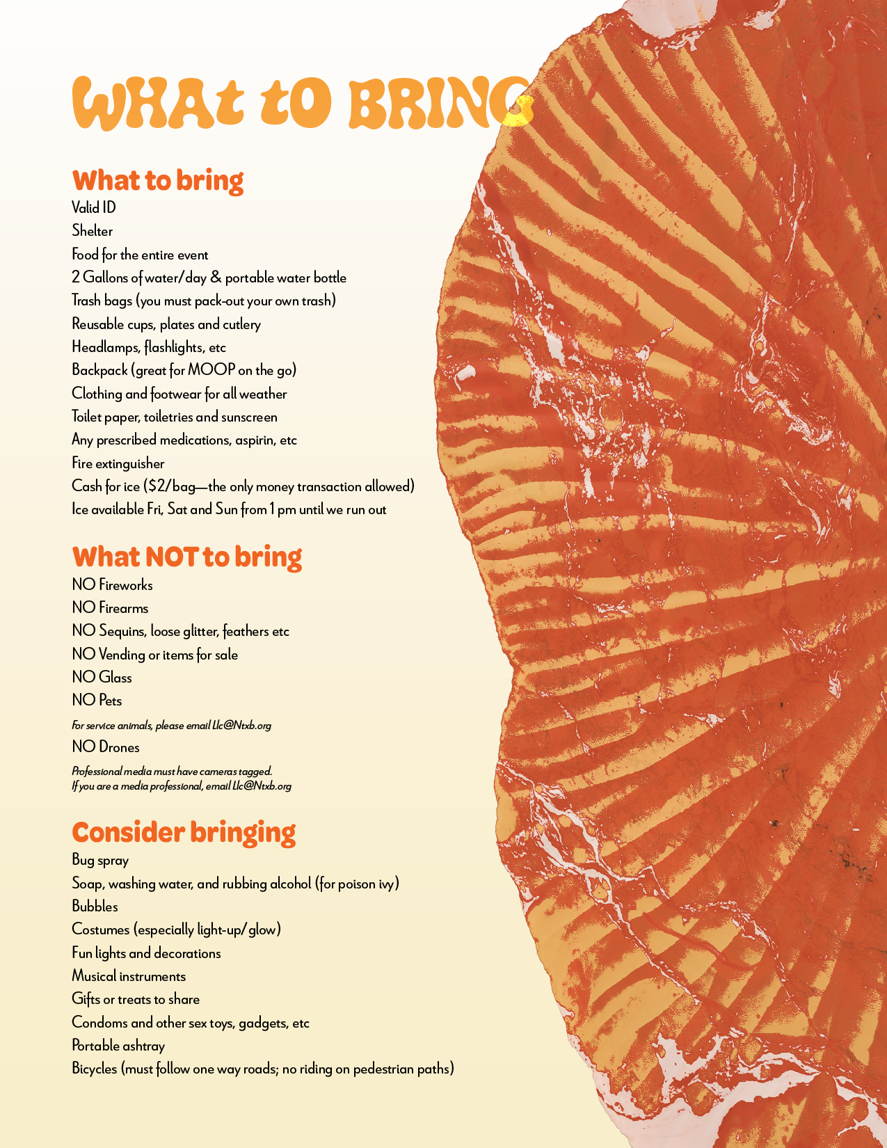
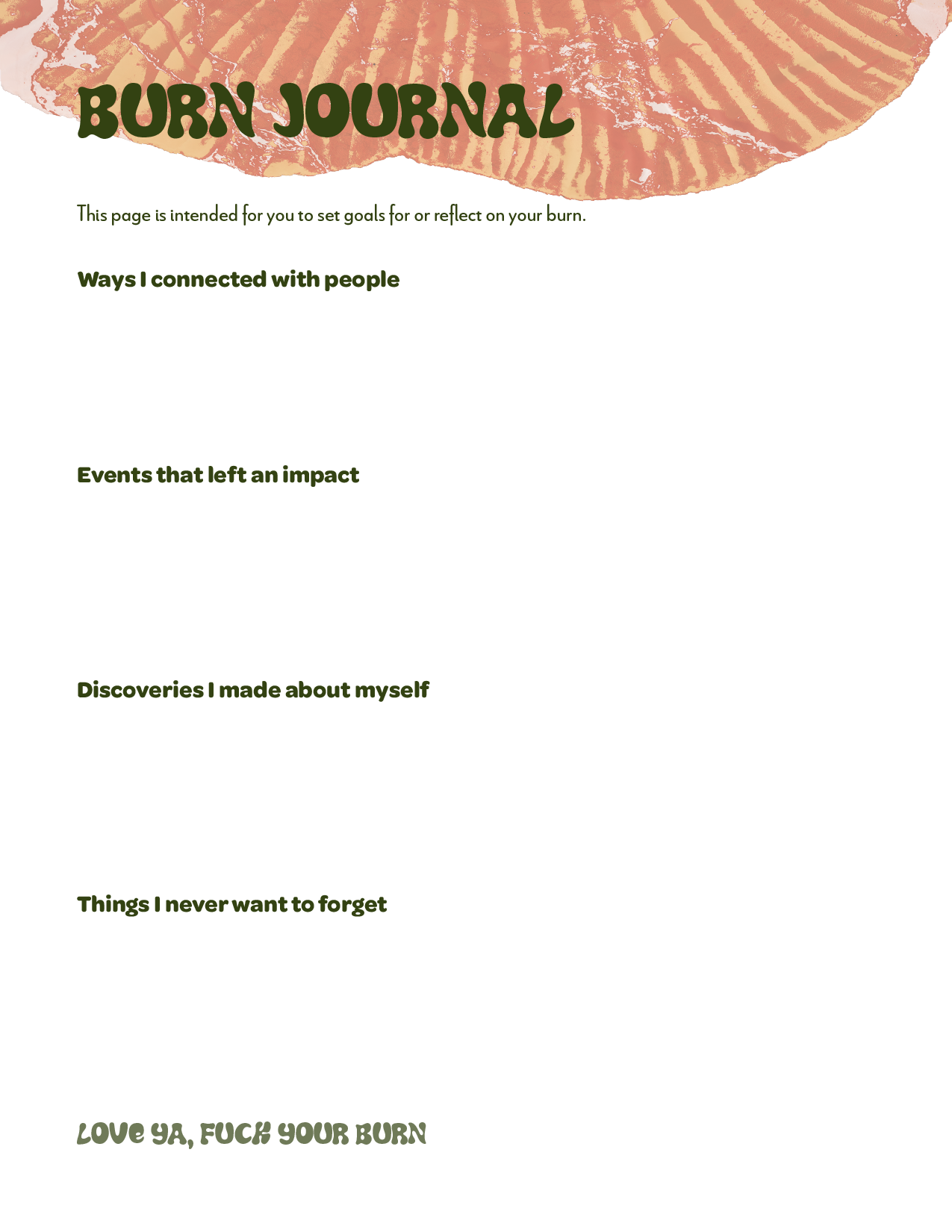
Each guide is a fully illustrated book that all participants are required to read. It’s designed to orient them, set the tone for the year's theme, and actually be worth reading.
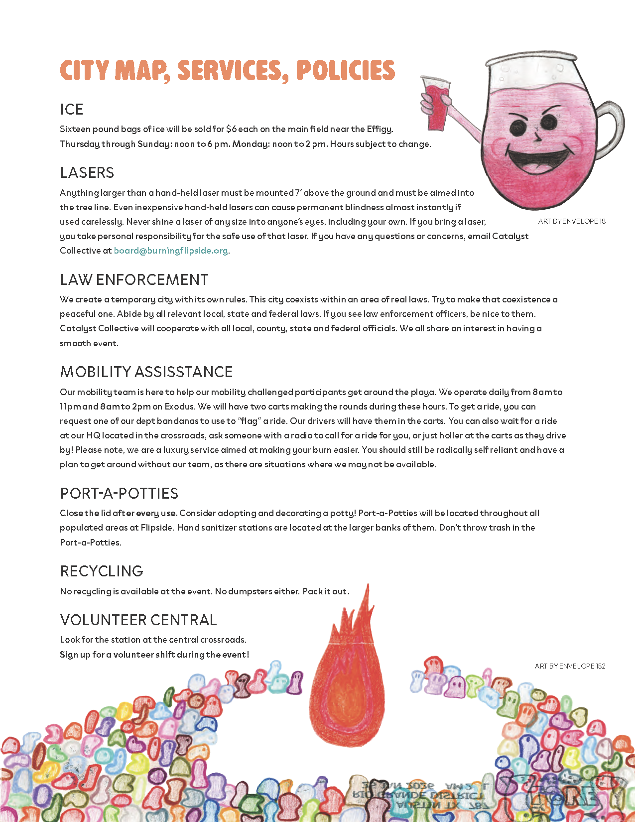
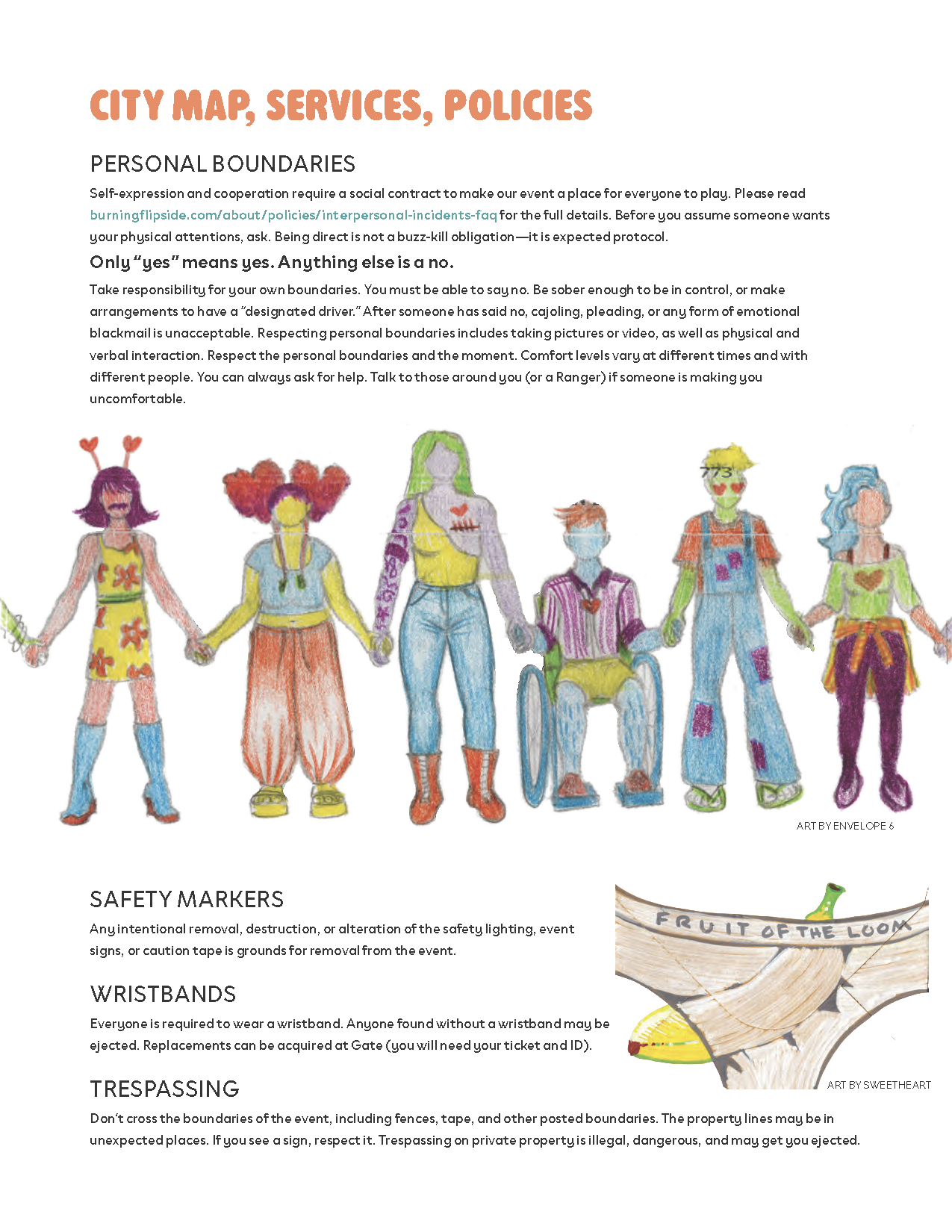
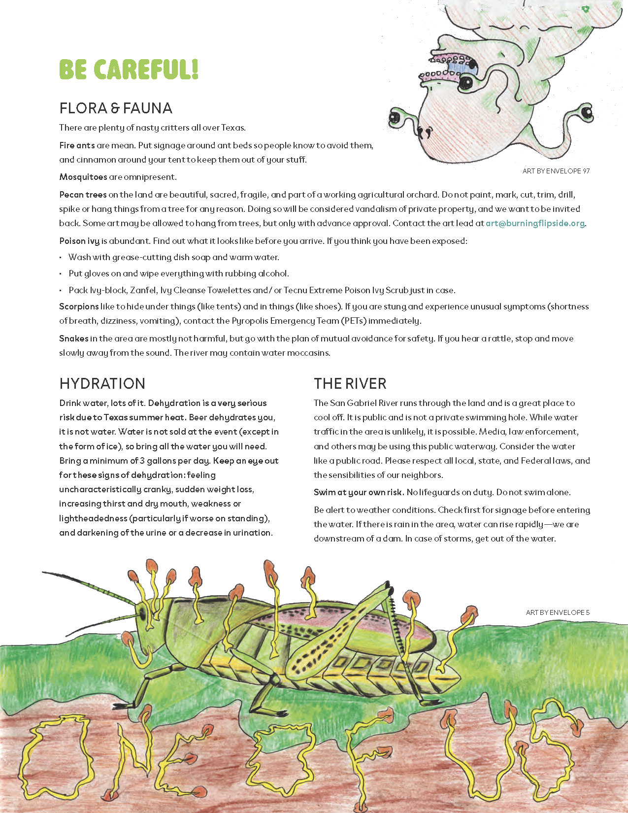
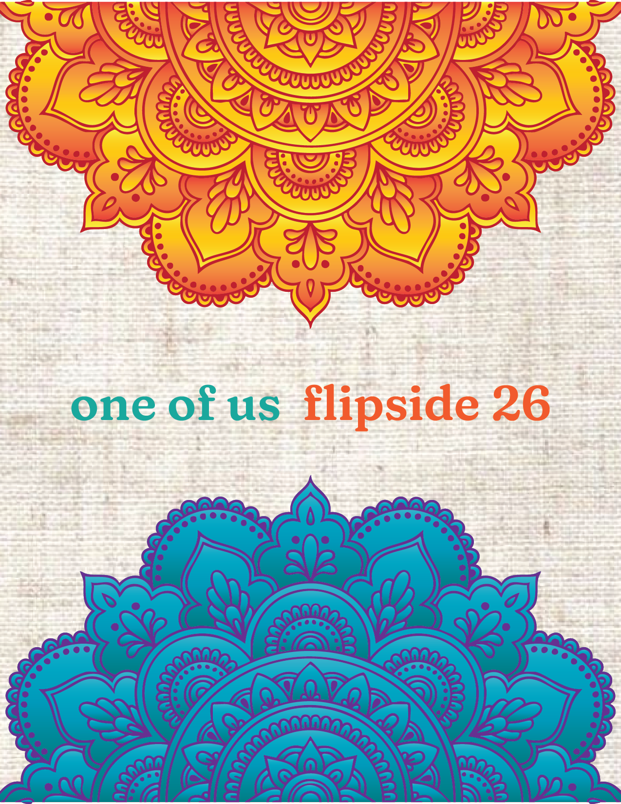
22-page guide, Wristband, Patch, Illustrations
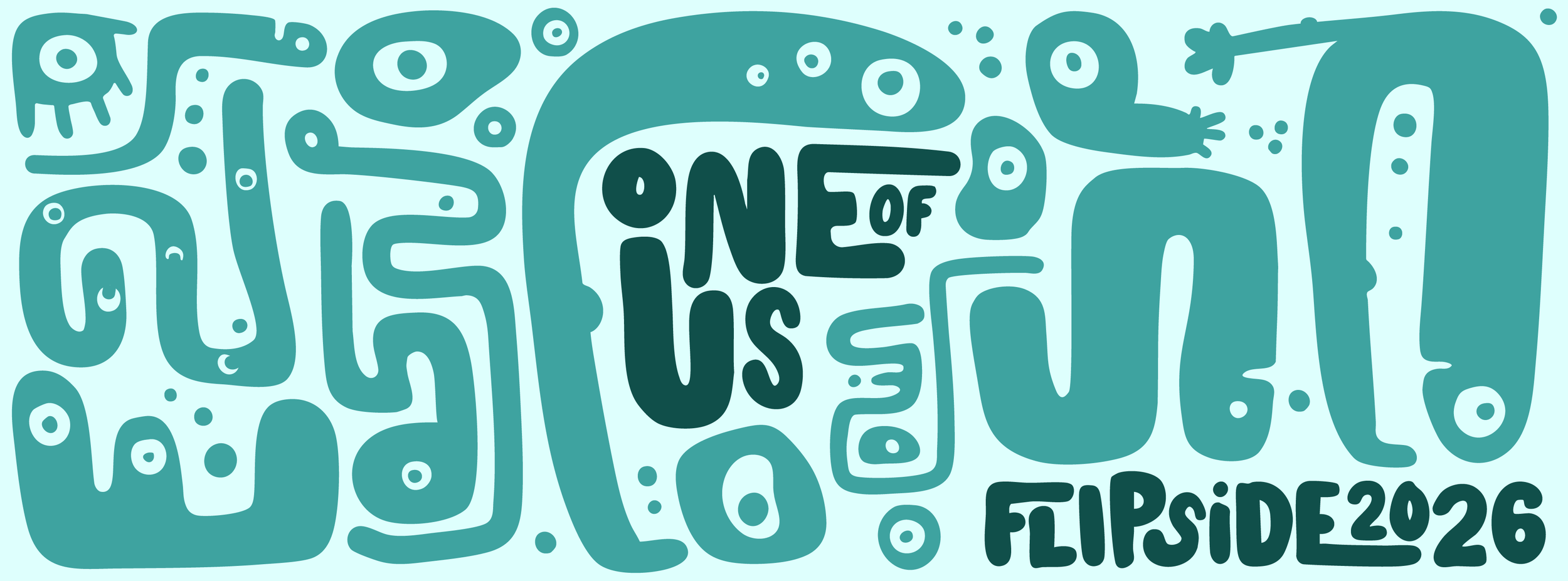
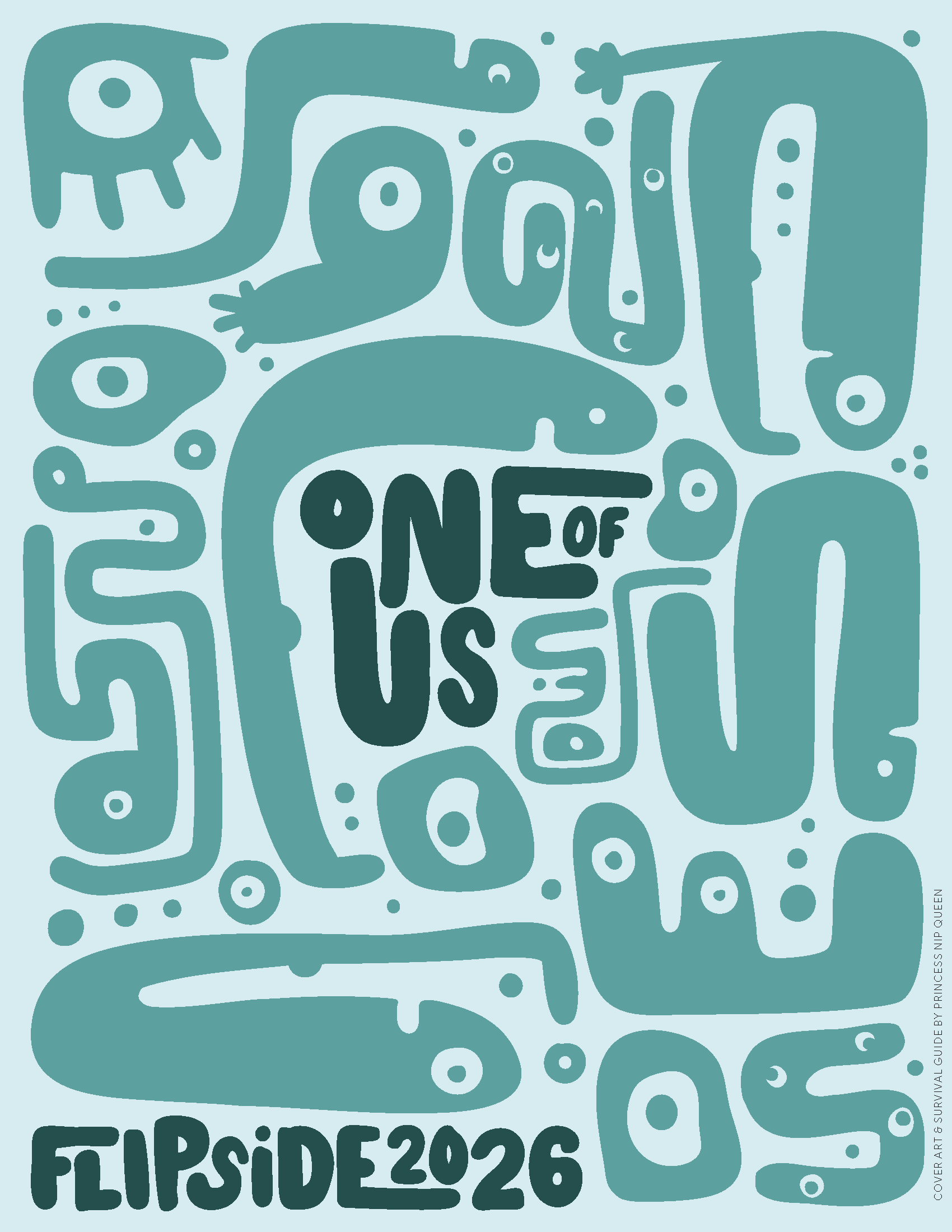
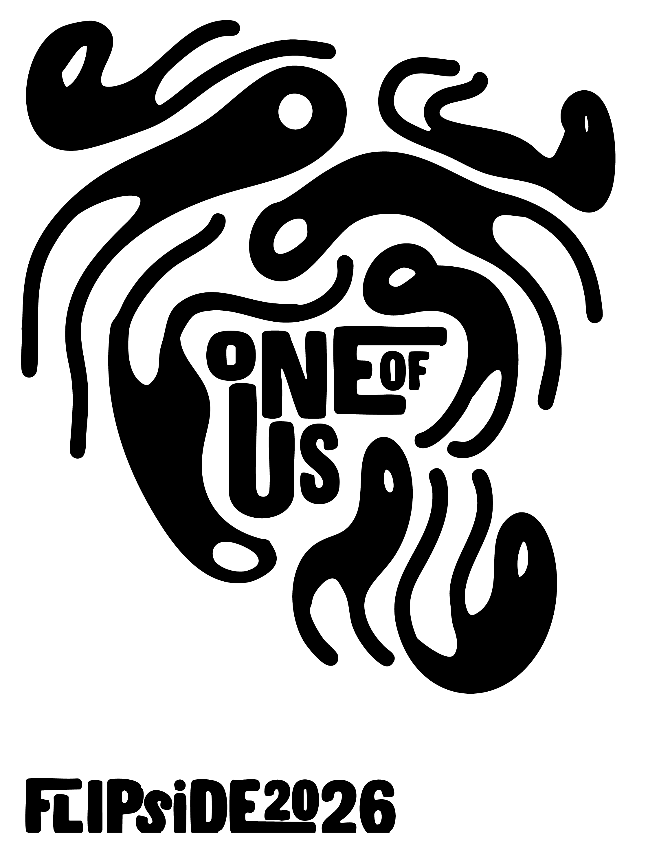
Burning Flipside 2026: One of Us
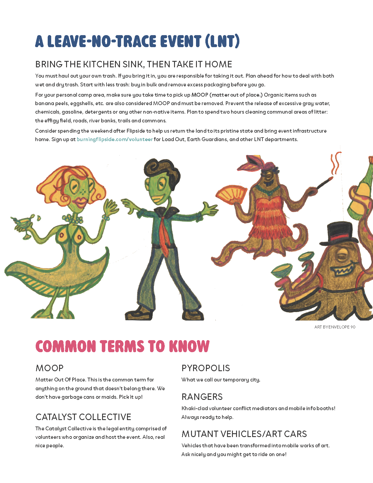
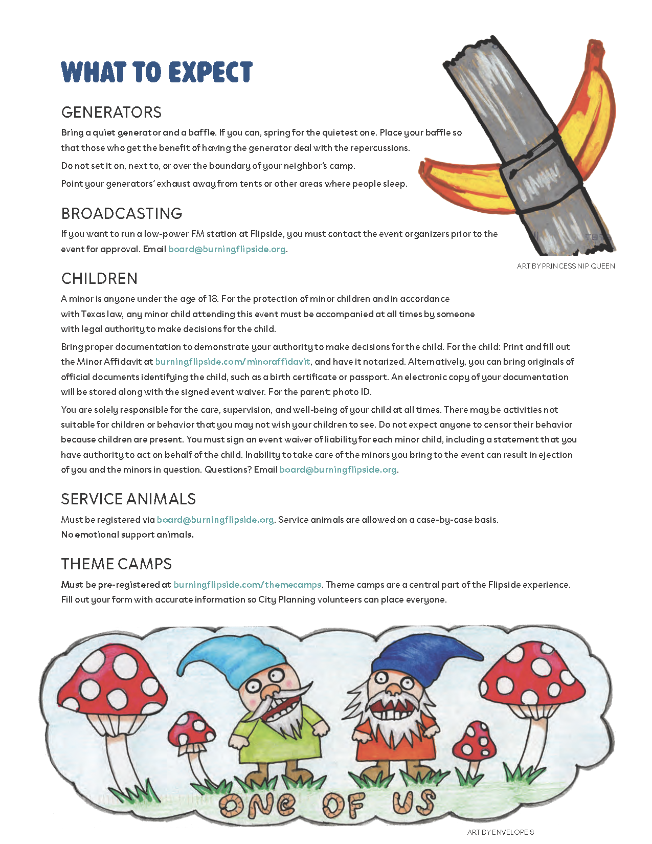
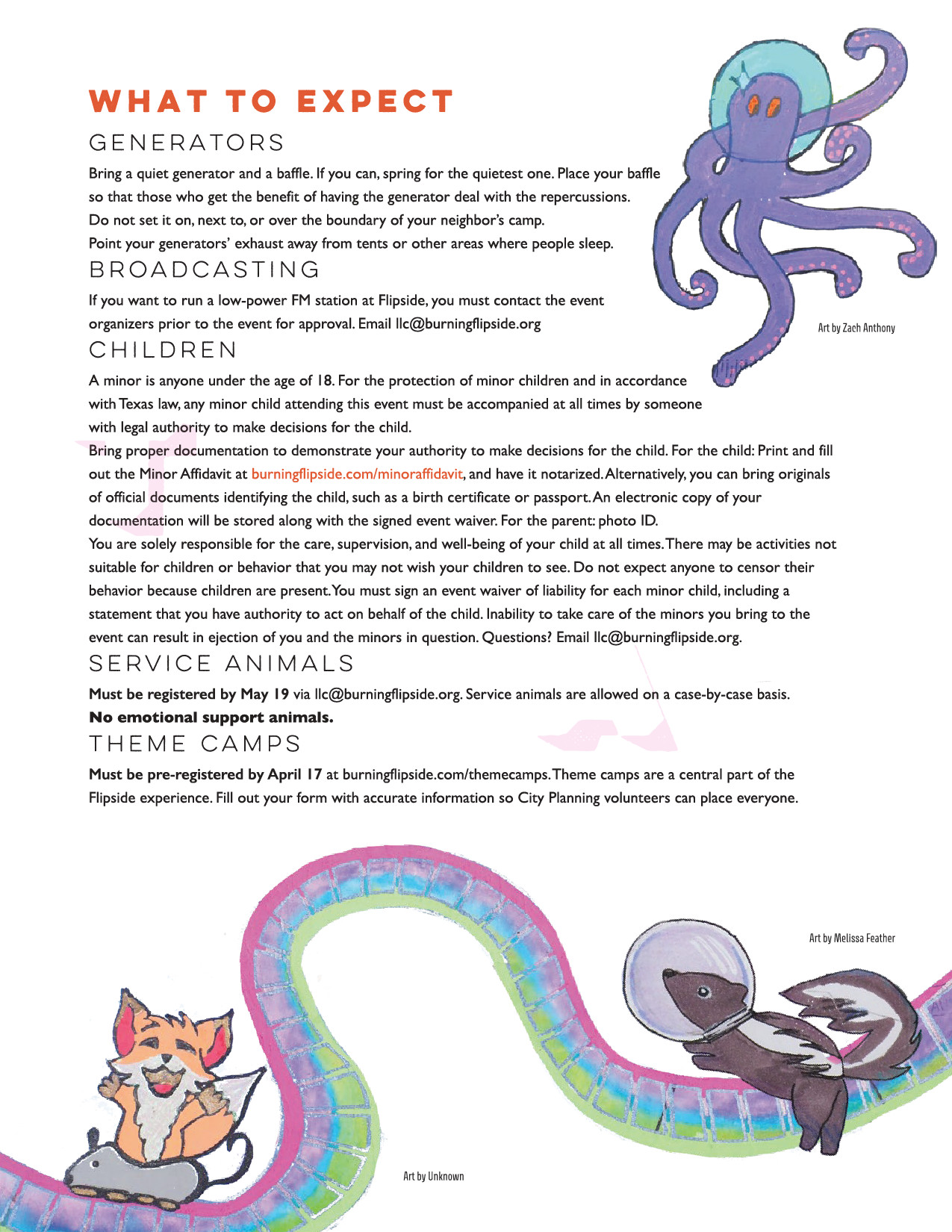
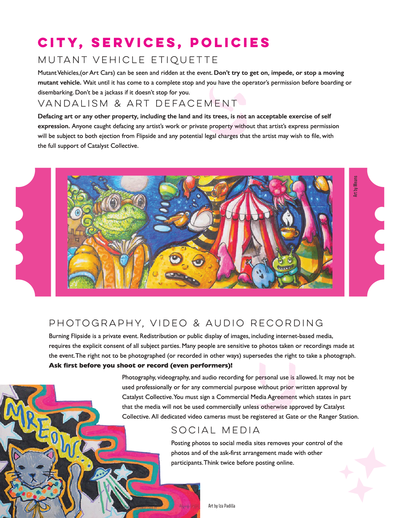
I interpreted this through the lens of the microscopic-organisms: too small to be seen individually, but together they form entire ecosystems. The illustrations imagine a cast of soft, strange creatures just existing alongside each other. No hierarchy, no agenda, just weird little guys cohabitating in harmony.
The palette leans warm and slightly alien, and the typographic system is meant to feel handmade.
The survival guide
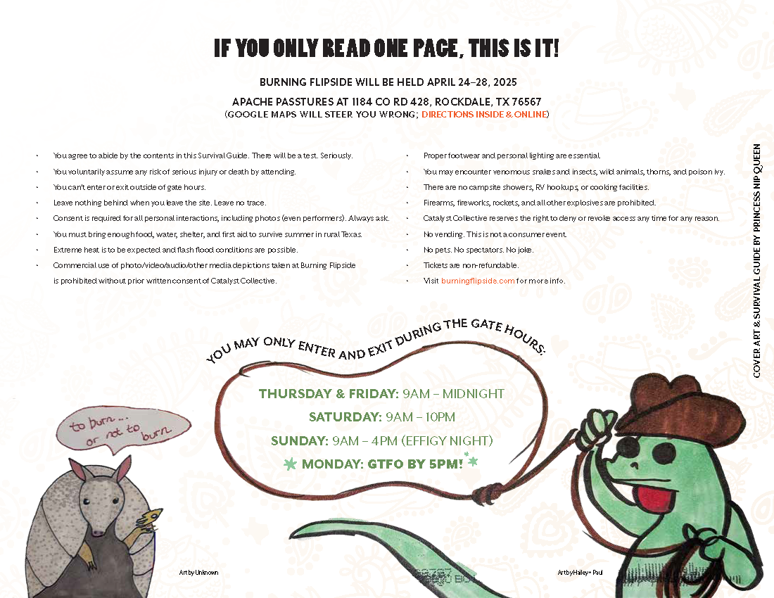
I did the cover, final page, font choices, color palette, and book layout. Images submitted by participants.
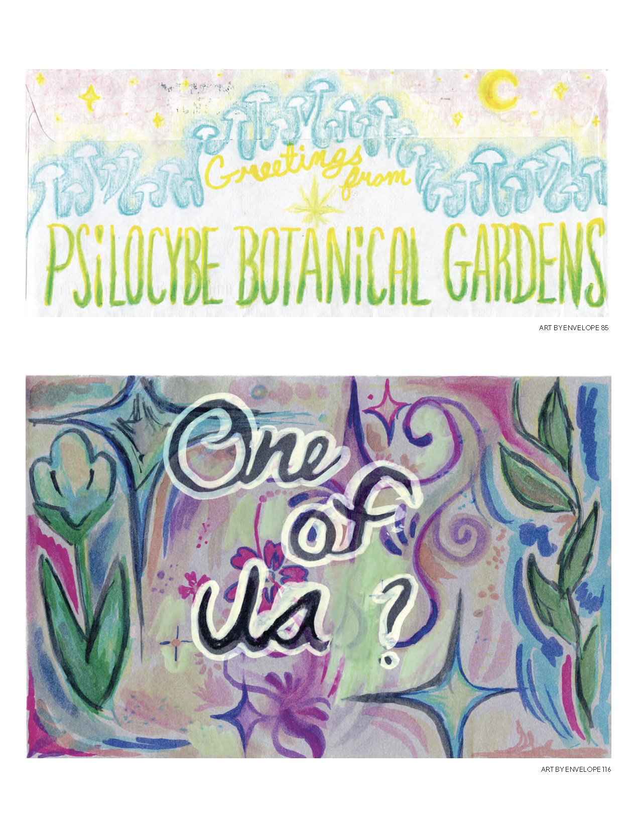
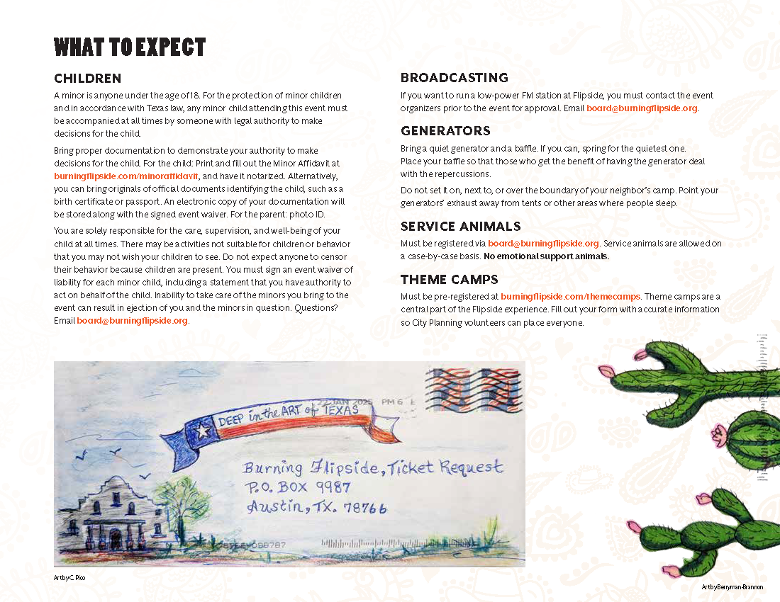
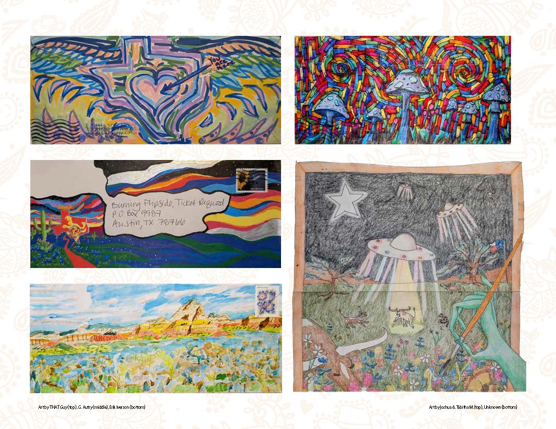
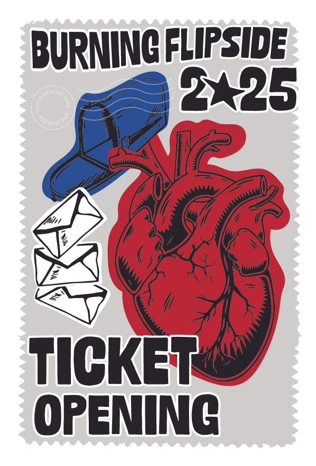
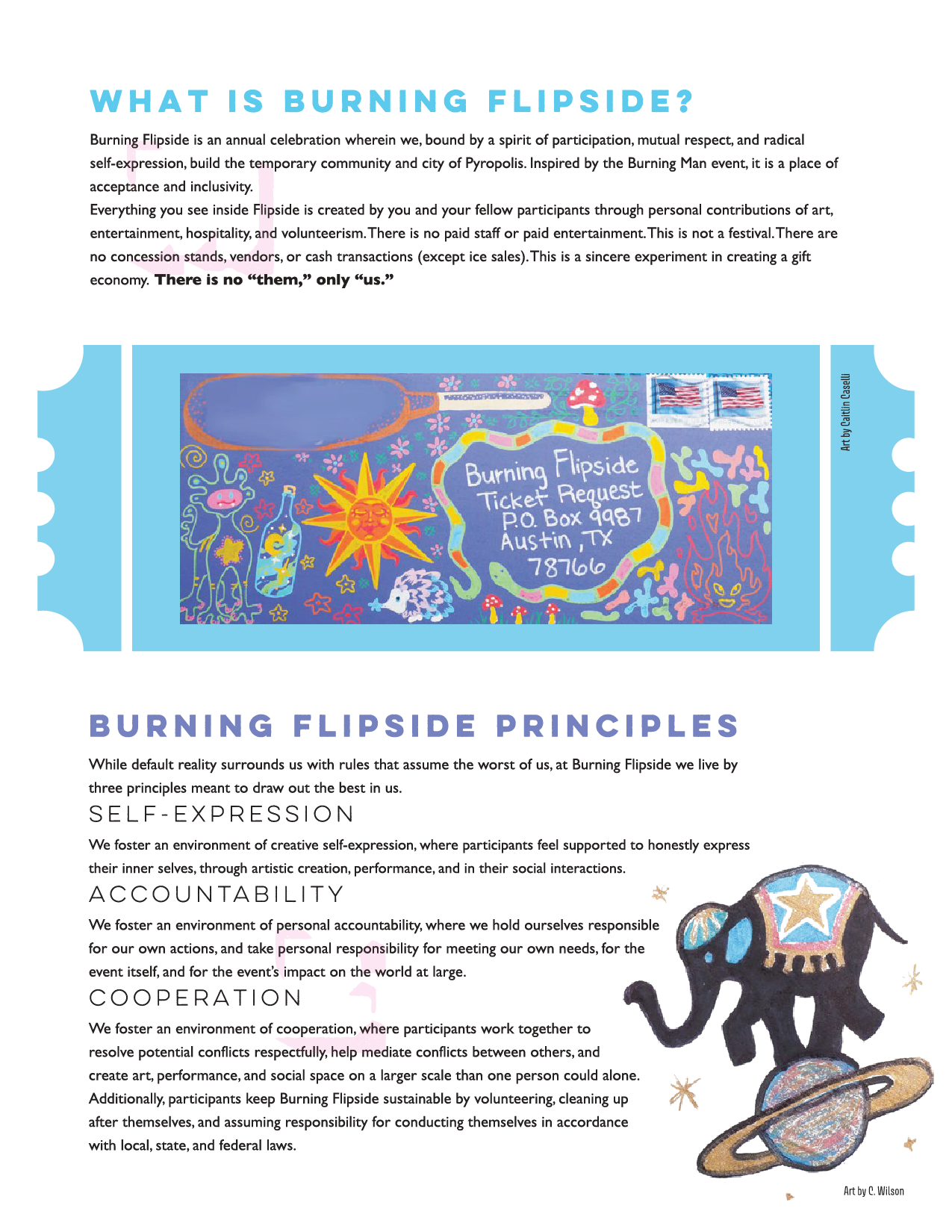
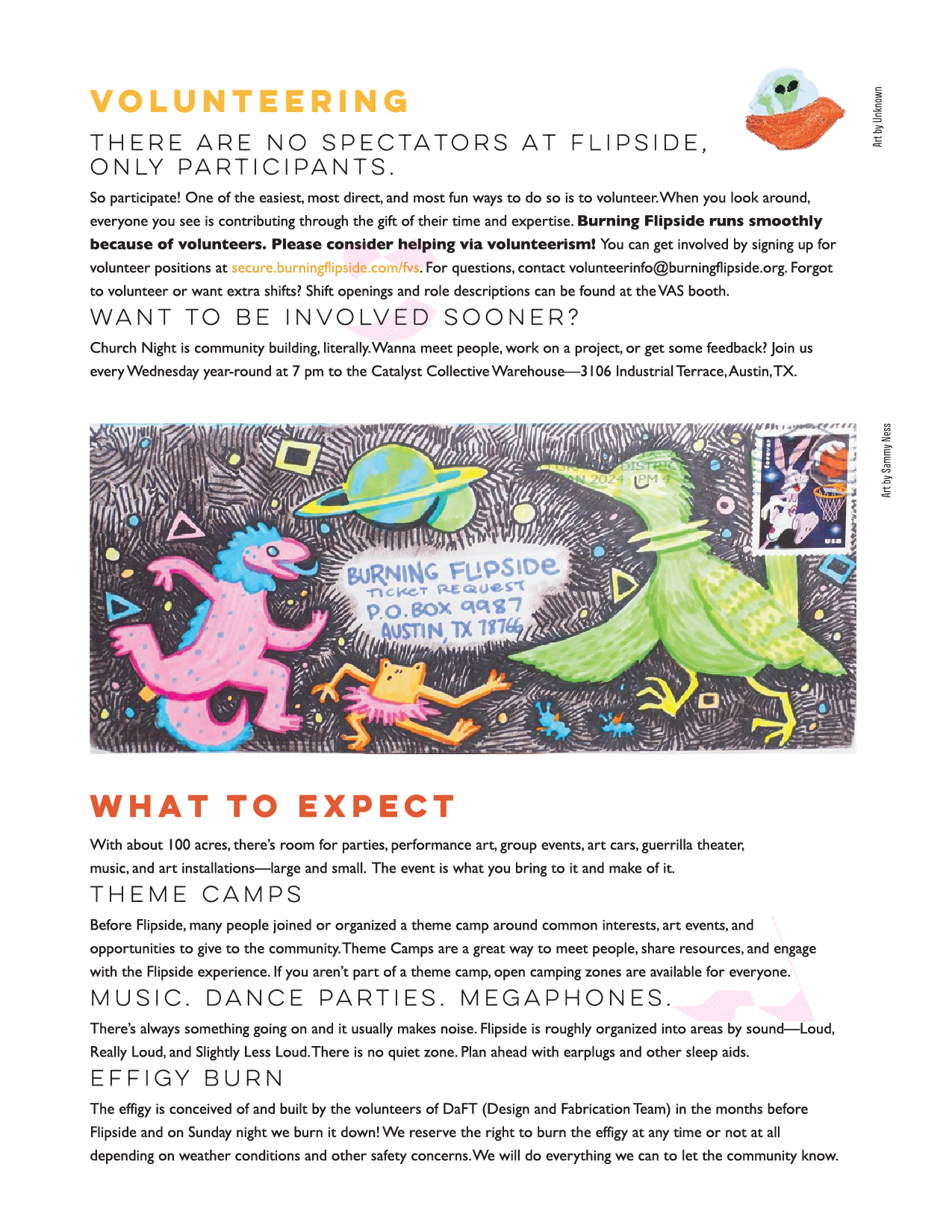
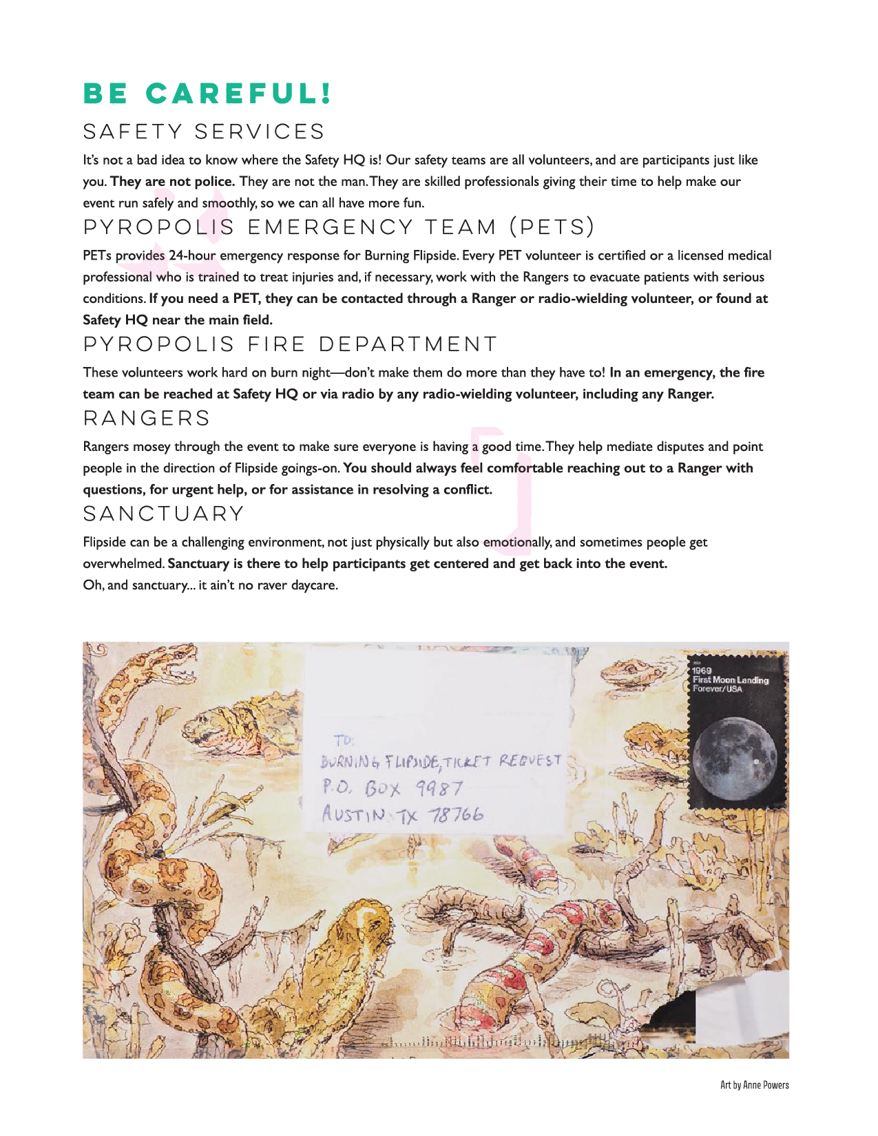
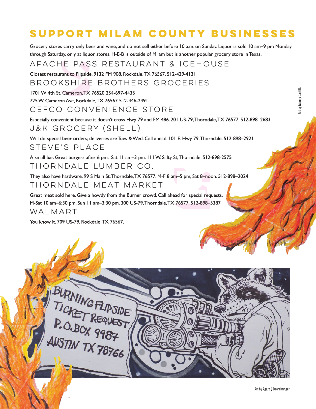
Flipside has a beloved tradition of participants submitting ticket requests inside hand-decorated envelopes. Past guides had always treated that envelope art as an afterthought, dropped in awkwardly. I wanted it to be the backbone of the design.
Process: Identity
I started with the question: How can I represent such an abstract concept of “One of Us?”

The first strong route was with a mandala. Mandalas represent the universe, wholeness, and the cosmos in Hindu and Buddhist traditions. I incorporated natural textures and rich gradients. As I was exploring, I felt that it wasn’t connected enough with the culture of Flipside.
Then I drastically shifted concepts. I have heard feedback time and time again that burns are a respite for people to feel at home, even if they don’t feel accepted in society. That’s when I shifted to think colony, group, belonging.
I made a handwritten version of the cover title in Procreate and started drawing these little cartoon guys mingling with each other and landed on this design. I ultimately shifted away from this because the energy felt more haunting and less like a loving community.
The wristband
The wristband carries the creature world off the screen and onto the wrist. UV-reactive neon green thread keeps the micro-organism concept alive after dark.
The client specified UV-reactive thread for safety visibility. I chose neon green to keep the color grounded in the micro-organism world rather than defaulting to a generic safety color, such as orange or yellow.

Print file: Wristband
The printers do PMS color match, but UV-reactive colors have to be specified.
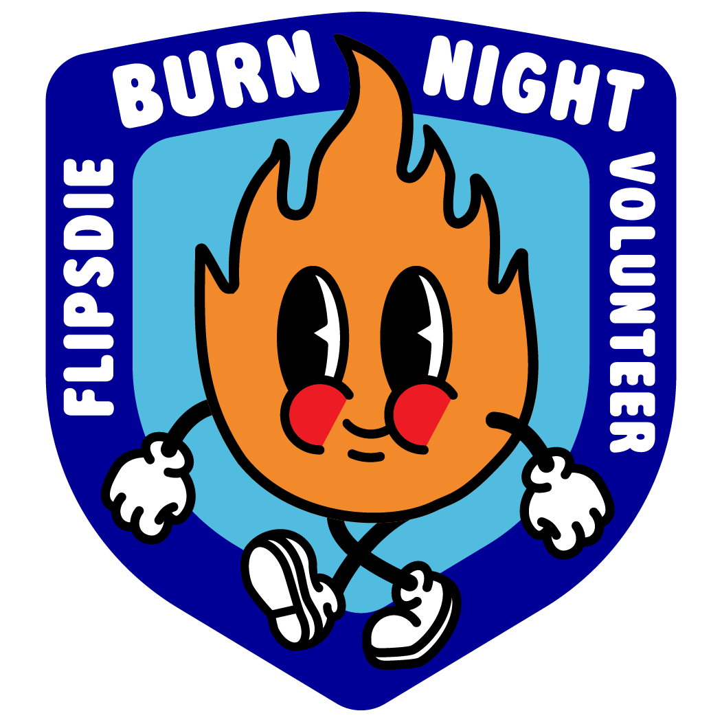
Patch design
Patch for the burn night volunteers. This is the least appealing volunteer shift, so the goal was to make it a very covetable and inspiring piece of swag.
My approach was to make fun imagery of what it would feel like to be walking around the burn perimeter of a roaring fire.
21-page guide · Wristband · Magnet · Bottle · Illustrations
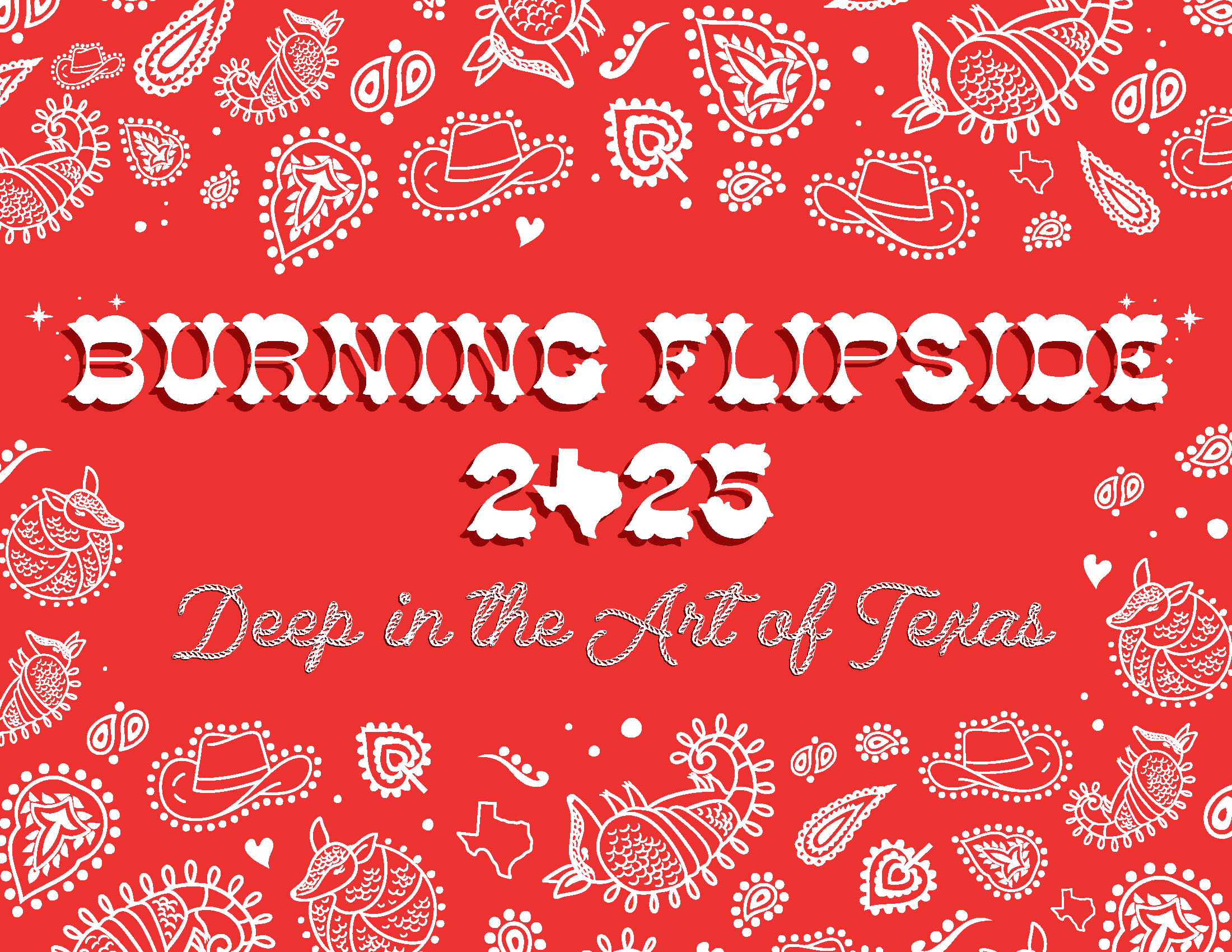
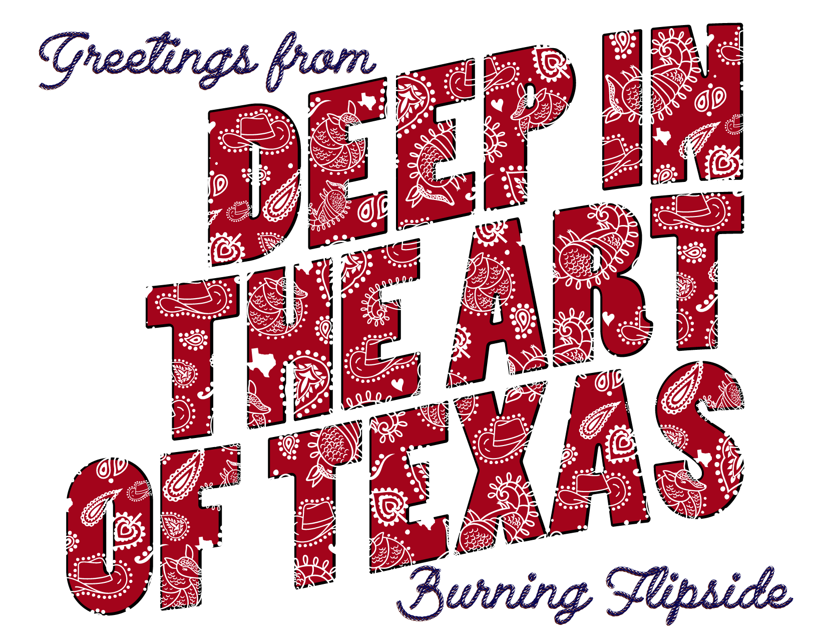
Burning Flipside 2025: Deep in the Art of Texas
The theme was all the heartbeat of Texas: art. It was a blend of our culture and the artistic twist the community puts on it.
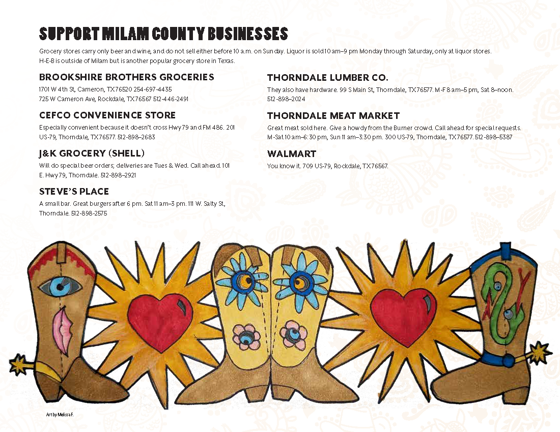
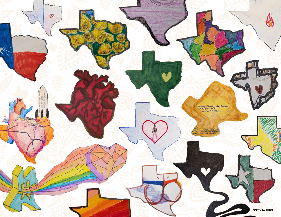
I illustrated a paisley bandana with iconic Texas imagery for the main visual identity of this theme.
The survival guide
I did the cover, final page, font choices, color palette, and book layout. Images submitted by participants.
The pattern is a hand-rendered design with Texan iconography blended with the classic paisley pattern.
I chose the headline typeface to represent the classic feel of outlaw posters and complemented it with a rope font to really drive it home.
Process: Identity
I started my process of defining the visual identity with the cover of the survival guide. I was inspired by the retro “Greetings from” postcards.
I had a few variations of color palettes and backgrounds, but I determined this approach to be a bit too clunky and cluttered in comparison to the direction I went.
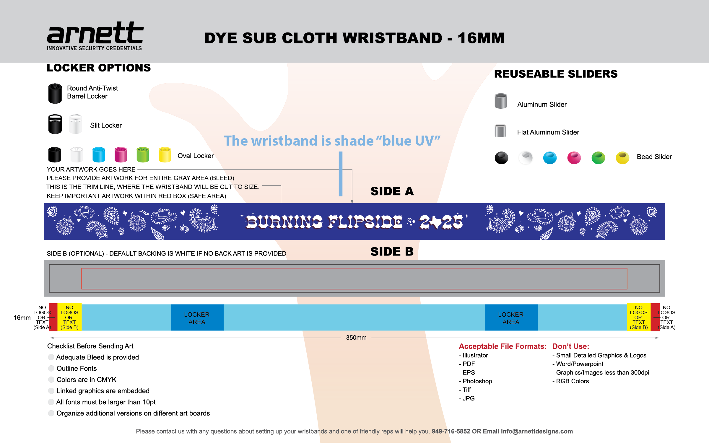
The wristband
For the wristband, I went dark… literally. A deep background lets the creature illustrations pop, and a subtle reference to "Deep in the Heart of Texas" ties the whole cosmic, microscopic world back to the playa it was made for.

Print file: Wristband
The printers do PMS color match, but UV-reactive colors have to be specified.
Magnet
Designed for the volunteers who process ticket envelopes, the swag takes the shape of a stamp as a nod to their role, with a literal heart of Texas at the center. The final piece combines original illustration with found art.
20-page guide · Map · Patch · Sticker · Bandana · Illustrations
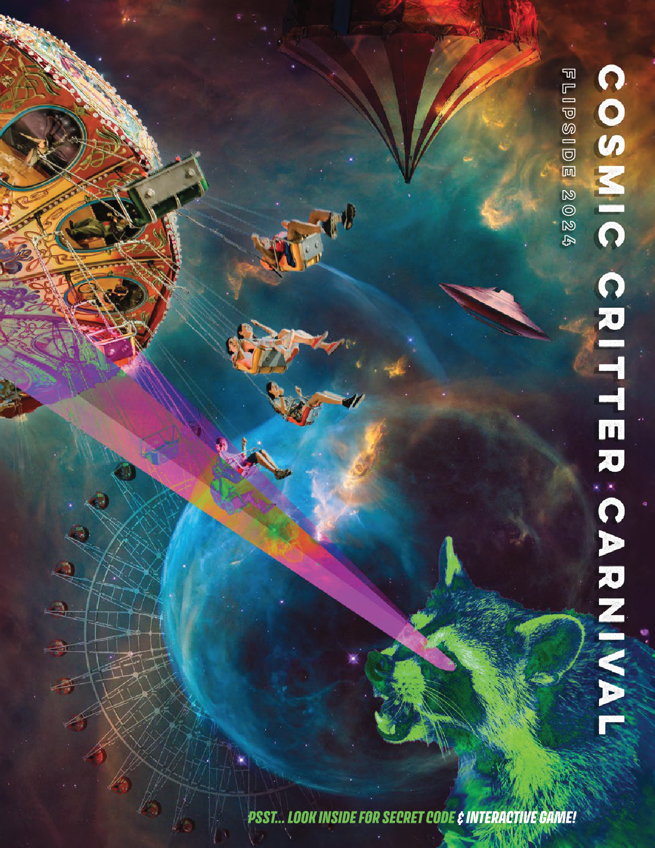
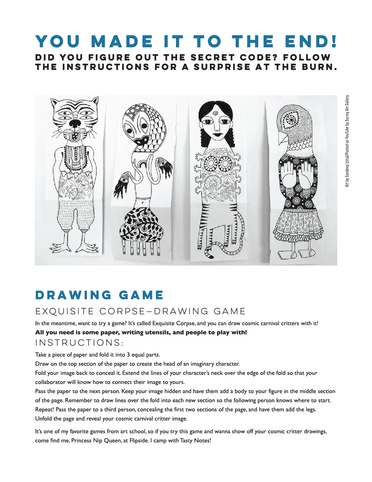
Burning Flipside 2024: Cosmic Critter Carnival
The theme was all about quirky creatures in a cosmic carnival. Due to it’s bizarre nature, I approached the visuals with a bizarre collage treatment.
The survival guide
I did the cover, final page, font choices, color palette, and book layout. Images submitted by participants.
I built the survival guide as a living collage — envelope art from participants layered, scaled, and composited into spreads that felt like they'd been assembled at the event itself, chaotic and collaborative. The cosmos provided structure; the critters provided chaos. The result was a book that felt less like official documentation and more like something the community actually made together.
The map
The map leans into the theme's inherent absurdity: a cow mid-abduction by a UFO carousel horse, grounded by a real NASA photograph that makes the whole thing feel just plausible enough.

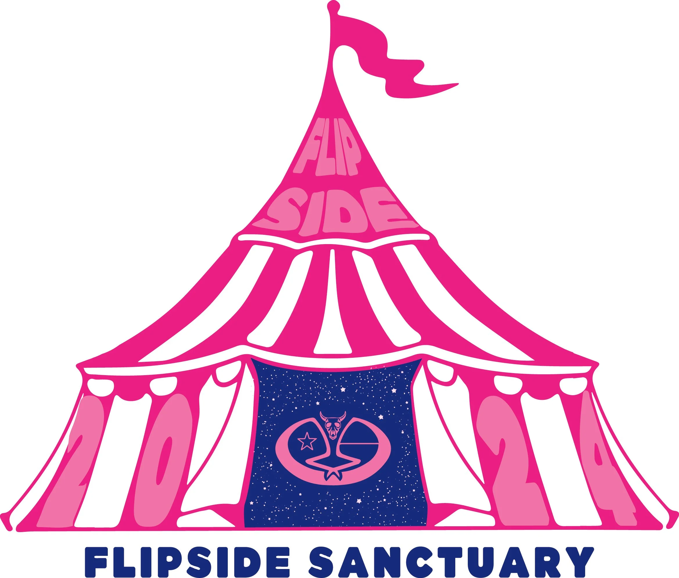
Sticker design
Sanctuary is a safe space for participants who need to step away and recenter. The design connects this place of respite to the larger carnival world; it’s a welcoming tent that signals comfort and care.
Patch design
Zone Czar volunteers manage parking for the event. The client wanted a Texas critter that felt at home in the Cosmic Critter Carnival world. It’s quirky, local, and instantly readable.

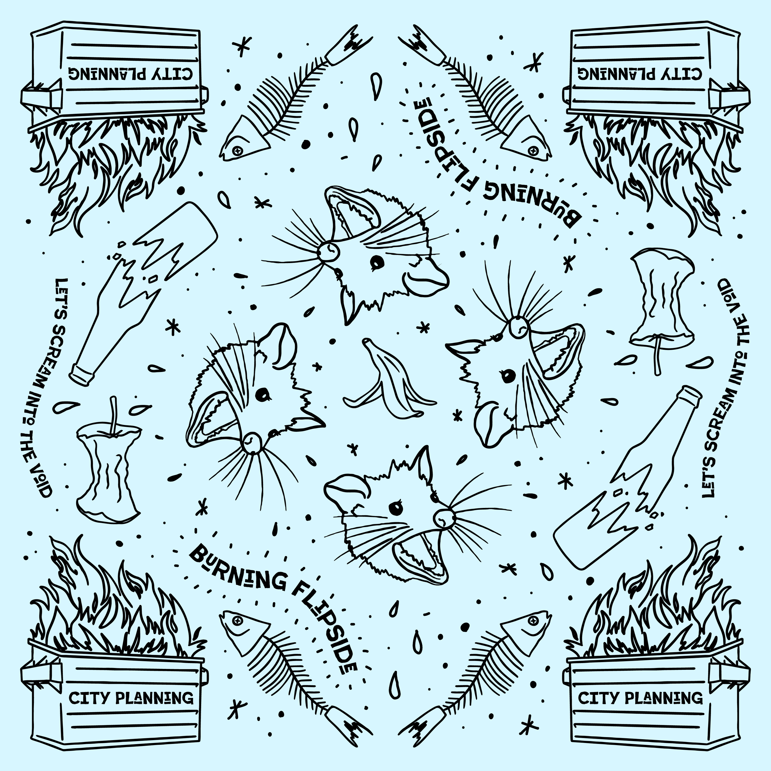
Bandana illustration
The client requested the bandana illustration to represent the kooky madness of a raccoon’s playground that is the temporary city of Flipside. My approach was to incorporate all the things a raccoon could want: trash and rotting food.
Survival guide · Photo manipulation
FreezerBurn 2024: The Eyes Have It
Eyes appear across virtually every era of art history: as a symbol, as a portal, as the thing that makes a portrait feel alive. I used that thread to structure a journey through time. Art from ancient through modern, each spread draws on the visual language of its era, unified by the recurring motif of the eye.
The survival guide
I did the imagery, font choices, color palette, and book layout.
The format is experimentally linear; it’s meant to be read as a single continuous path, the way you'd walk through a gallery. The imagery shifts to mirror the period, while a consistent color logic keeps it coherent throughout. Textures of ripped pages, paint, and oil are featured throughout.


Illustration · Identity · Typesetting · Print production
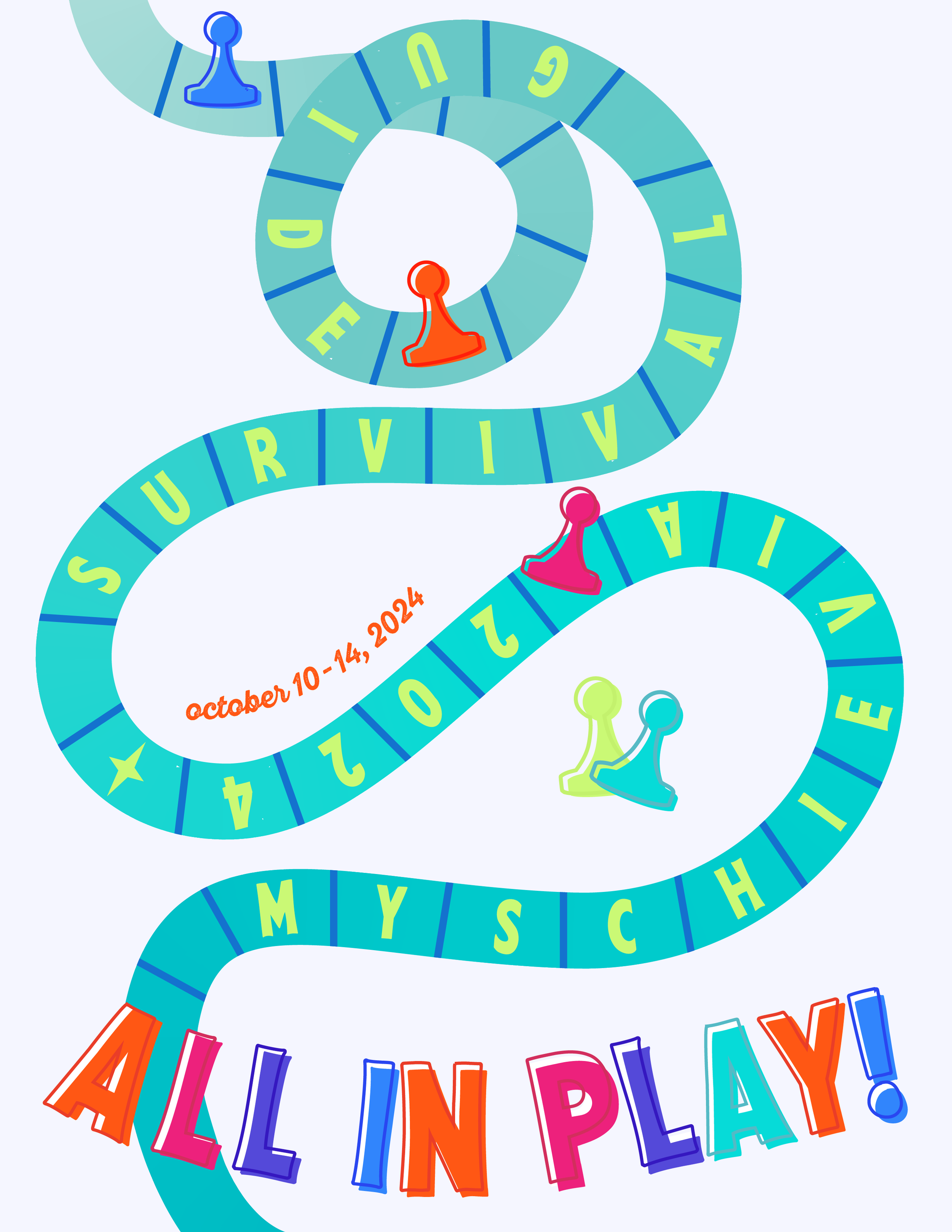
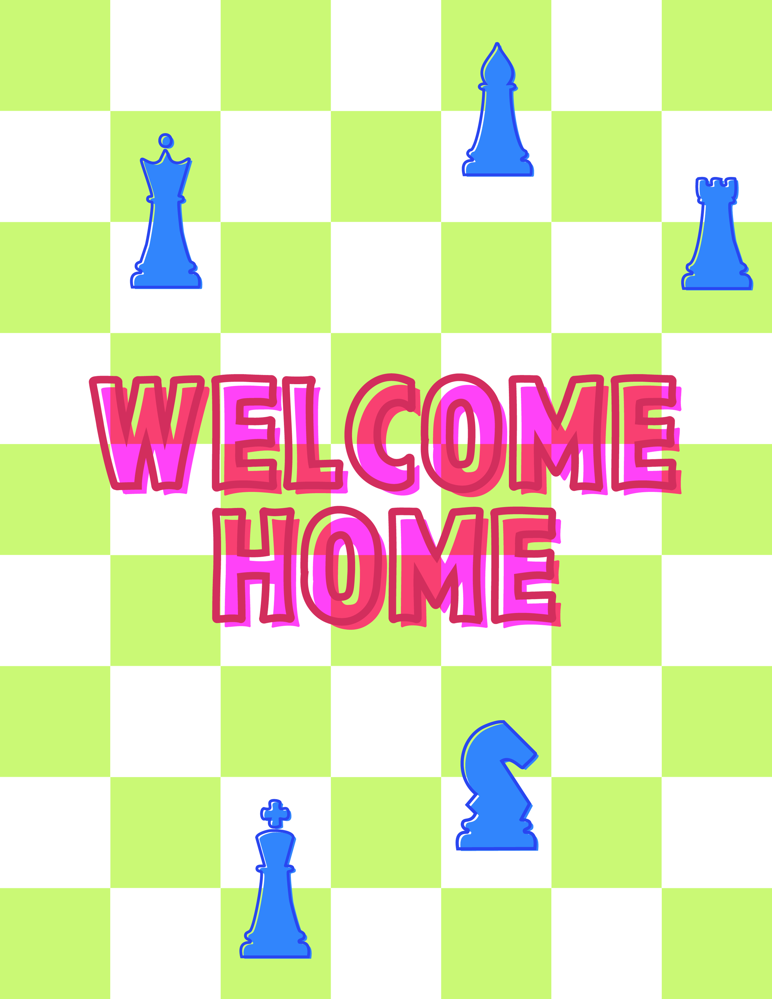
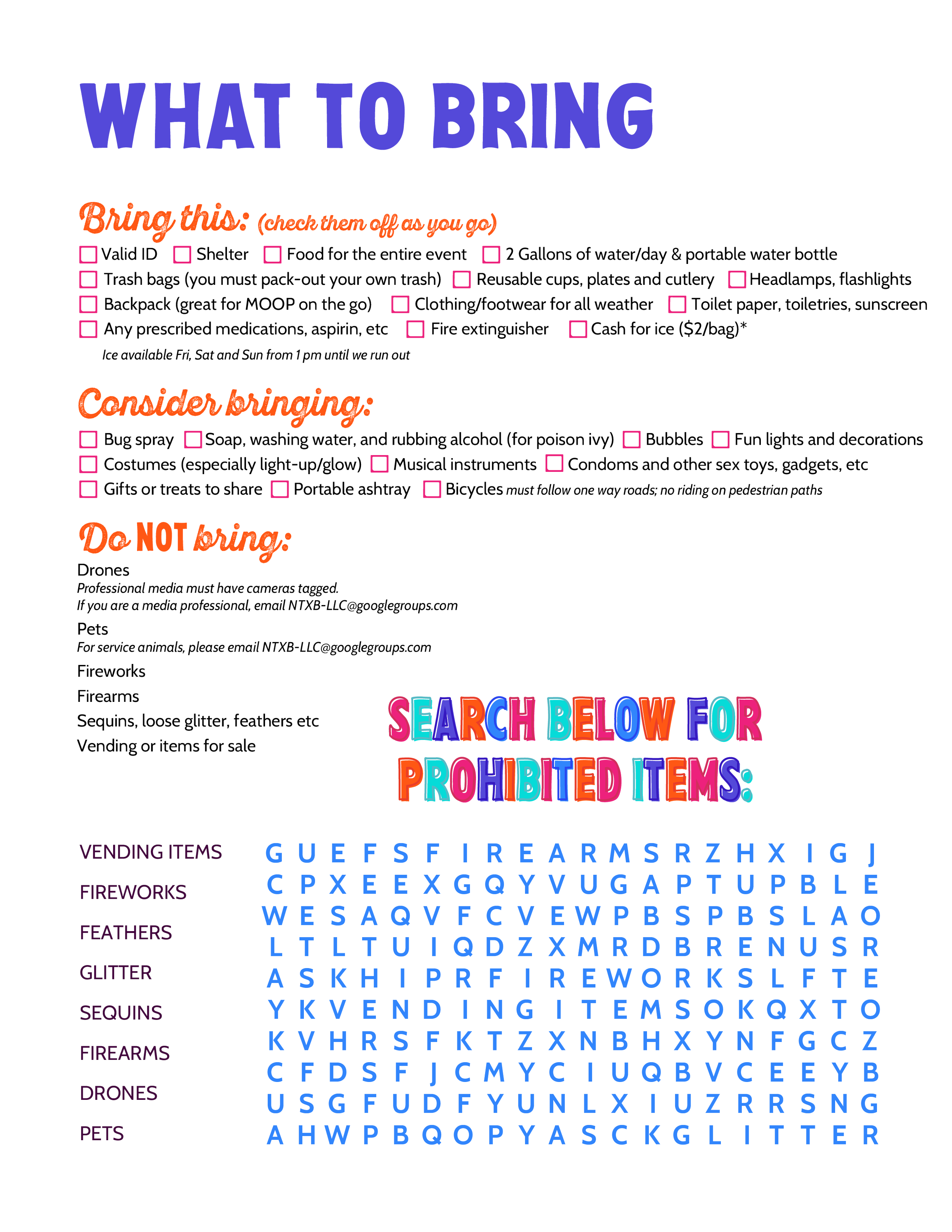
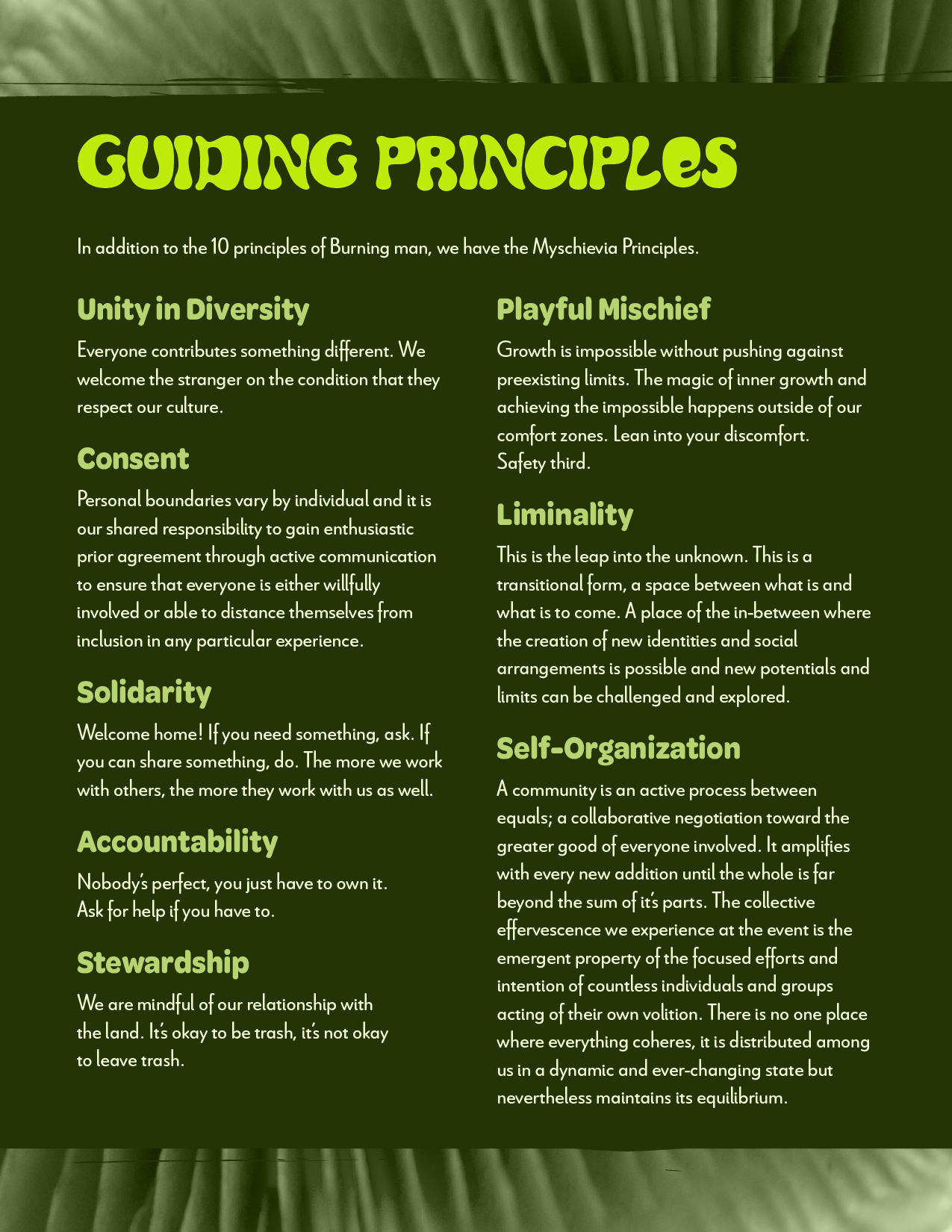
Myschievia 2024: All in Play
My approach to the theme was to embrace the play for adults. I was inspired by retro board games and the game books I would play with on long car rides as a child.
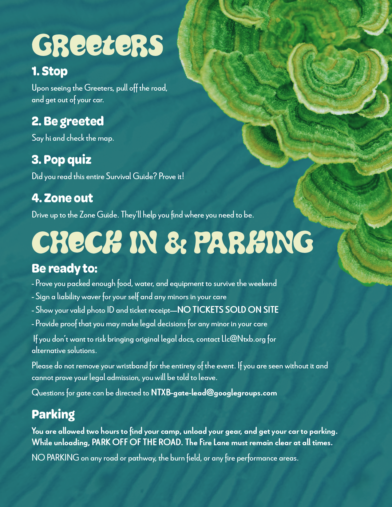
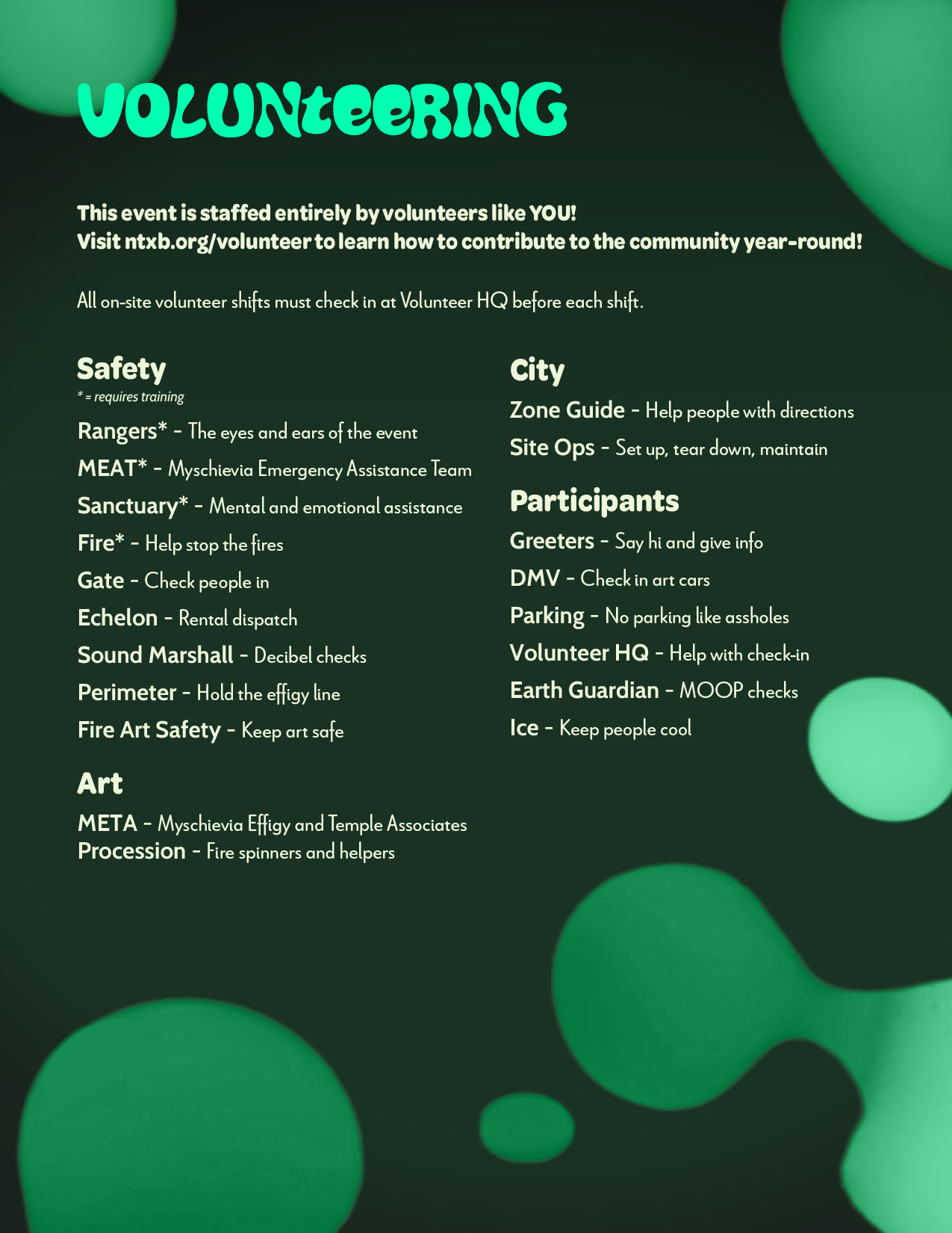
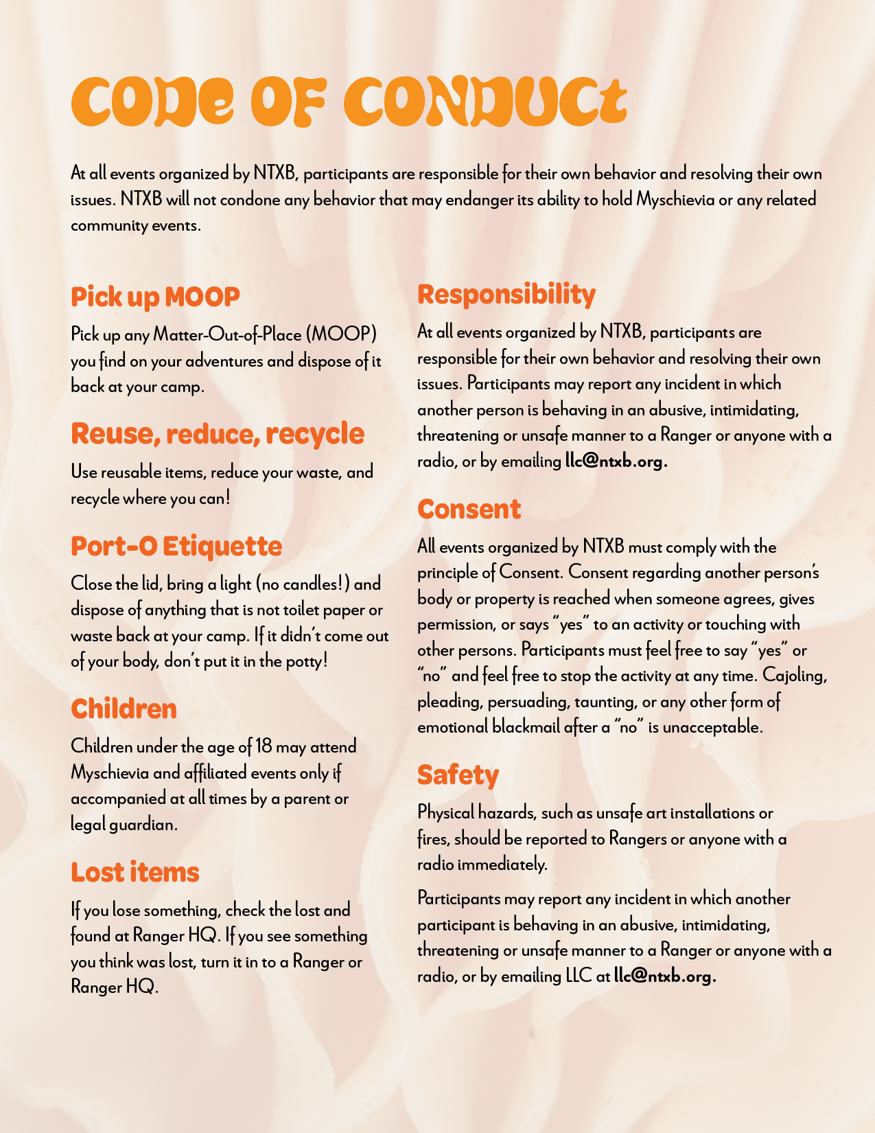
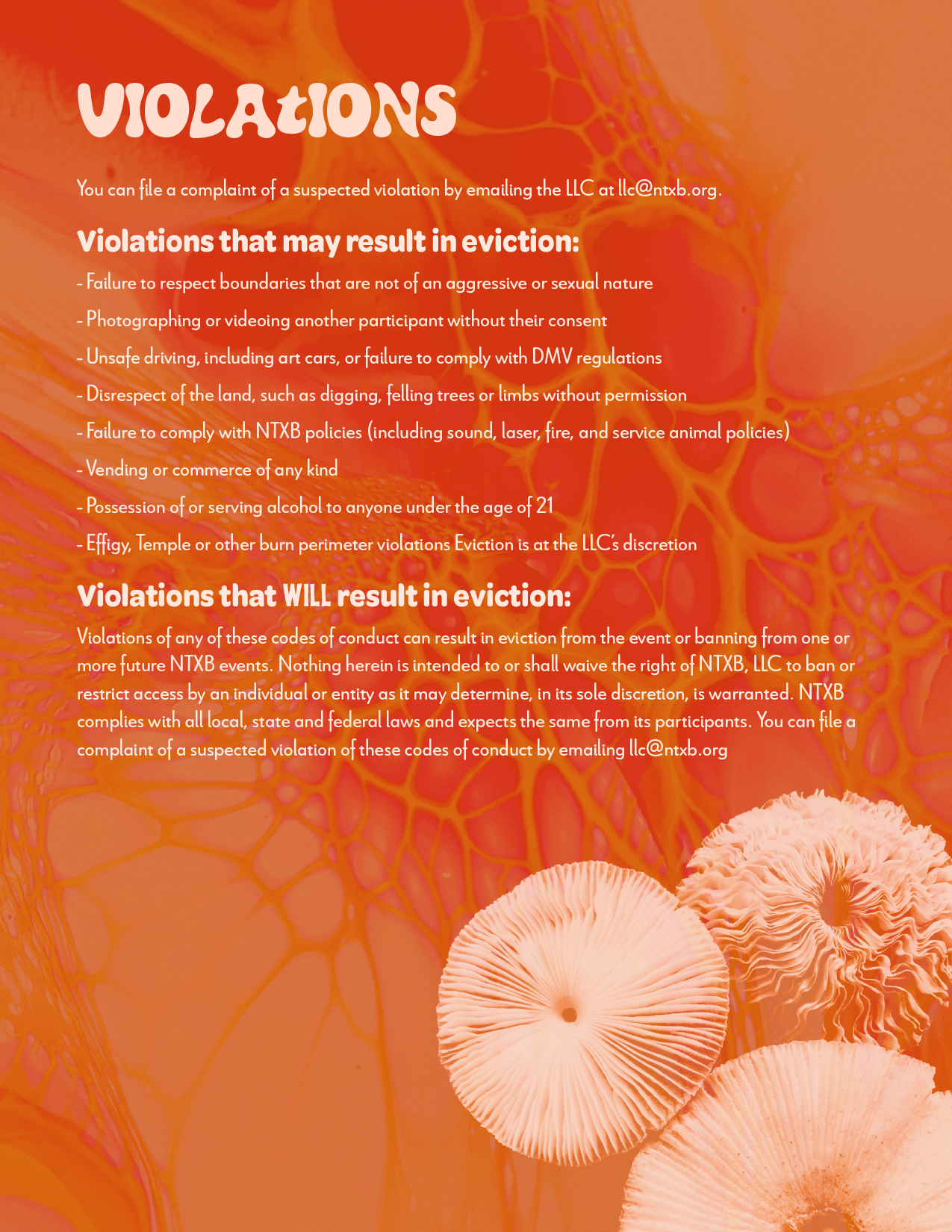
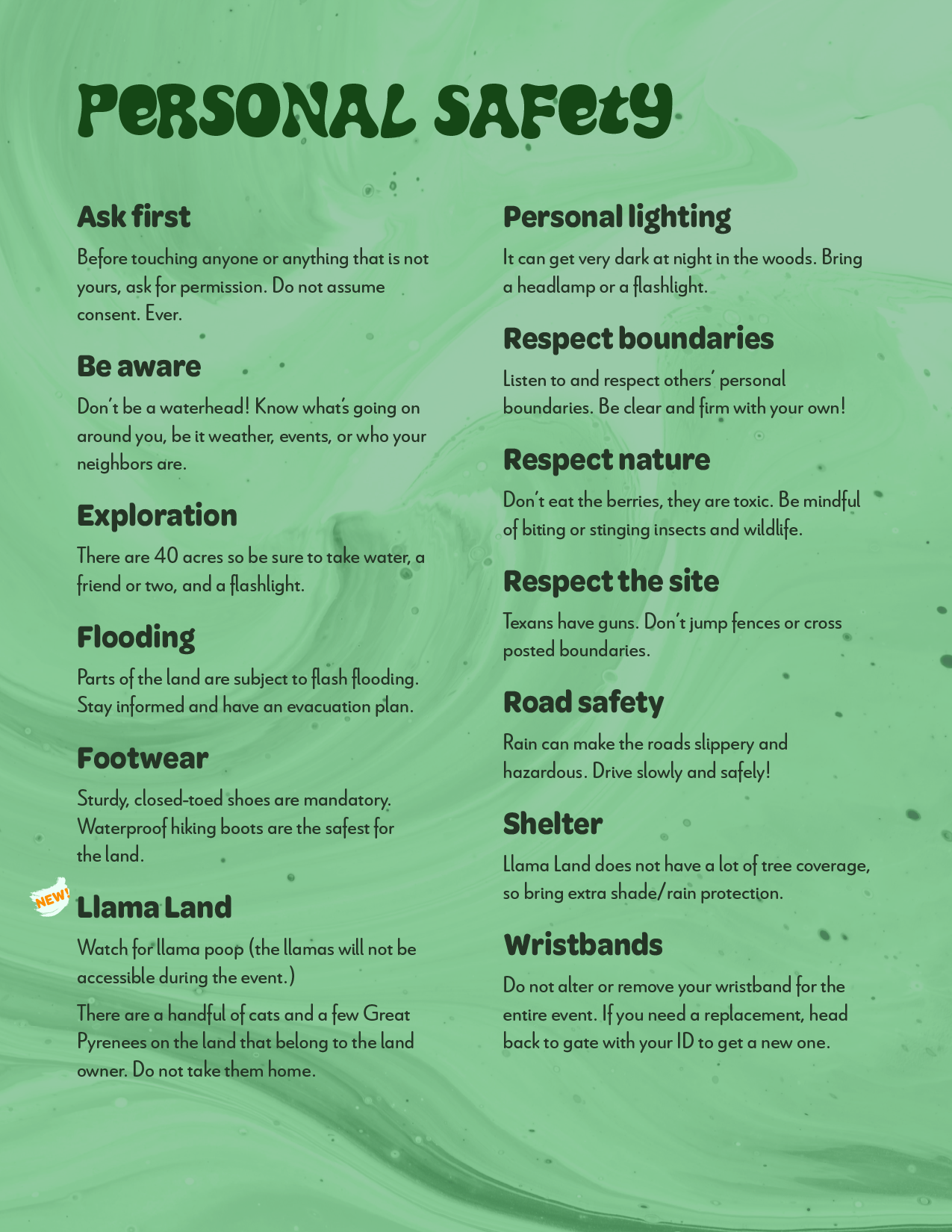
The survival guide
I did the illustrations, font choices, color palette, and book layout.
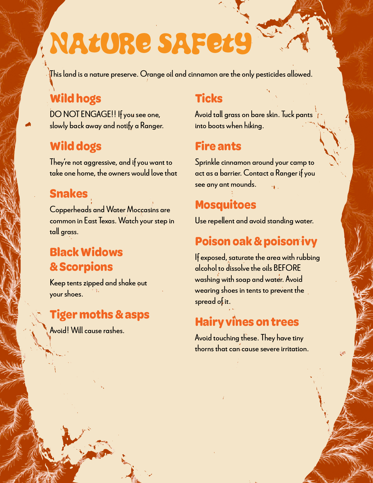
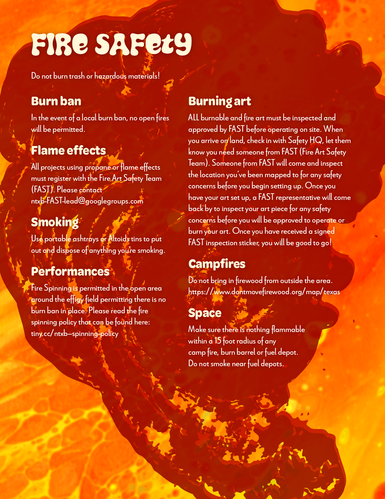
A survival guide is, at its core, a manual. Dense and necessary, but rarely something people want to read. The theme gave me permission to fix that.
I designed the guide as an activity book. Mazes, word searches, fill-in prompts, and games are woven throughout the practical content — so that reading about fire safety or camp etiquette comes wrapped in the tactile, playful energy of a childhood Saturday morning. The book becomes the first artifact of the experience, not just the instructions for it.


The wristband
The continuation of the brand manifests with the same vivid colors and board game pieces dancing across the wristband.

Identity · Typesetting · Print production · Photo manipulation
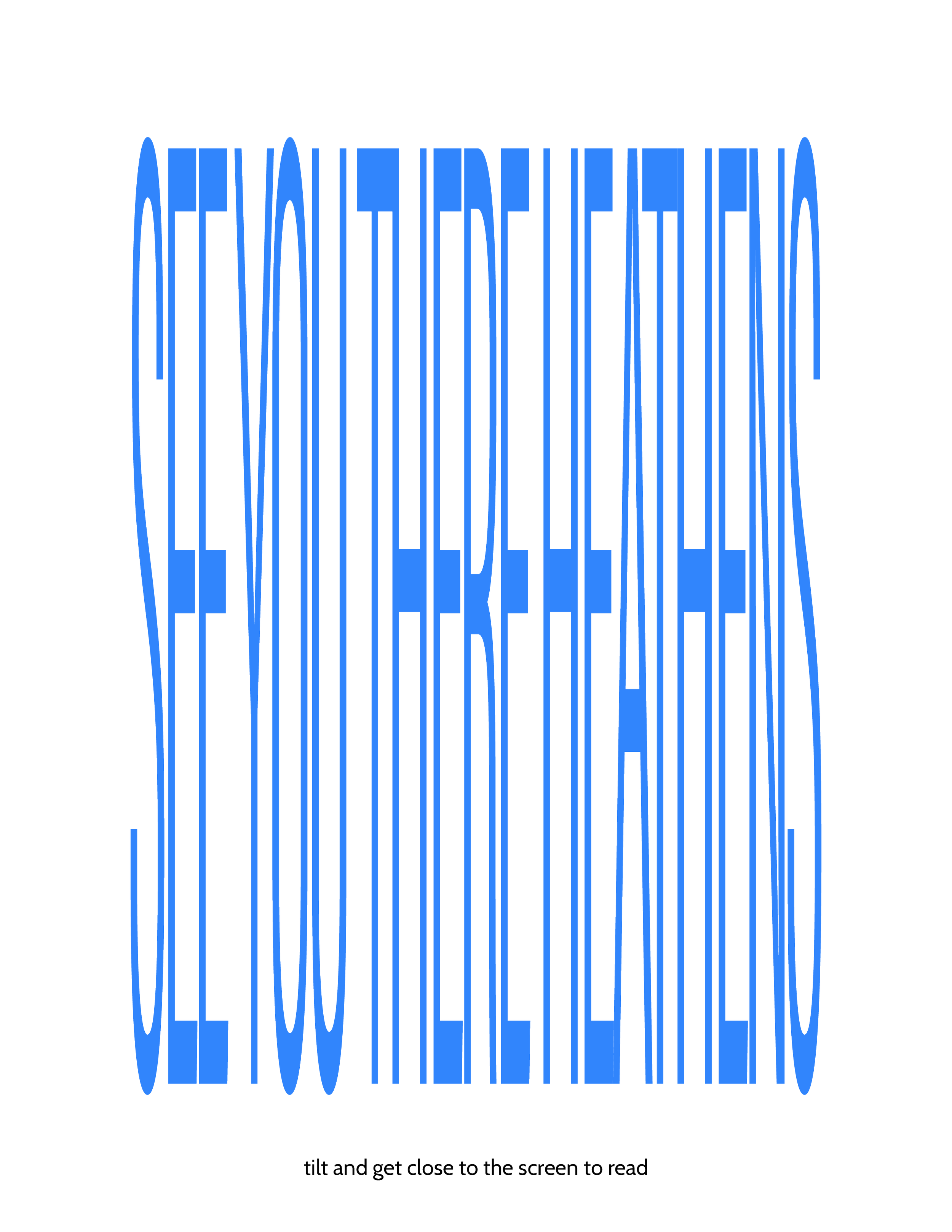
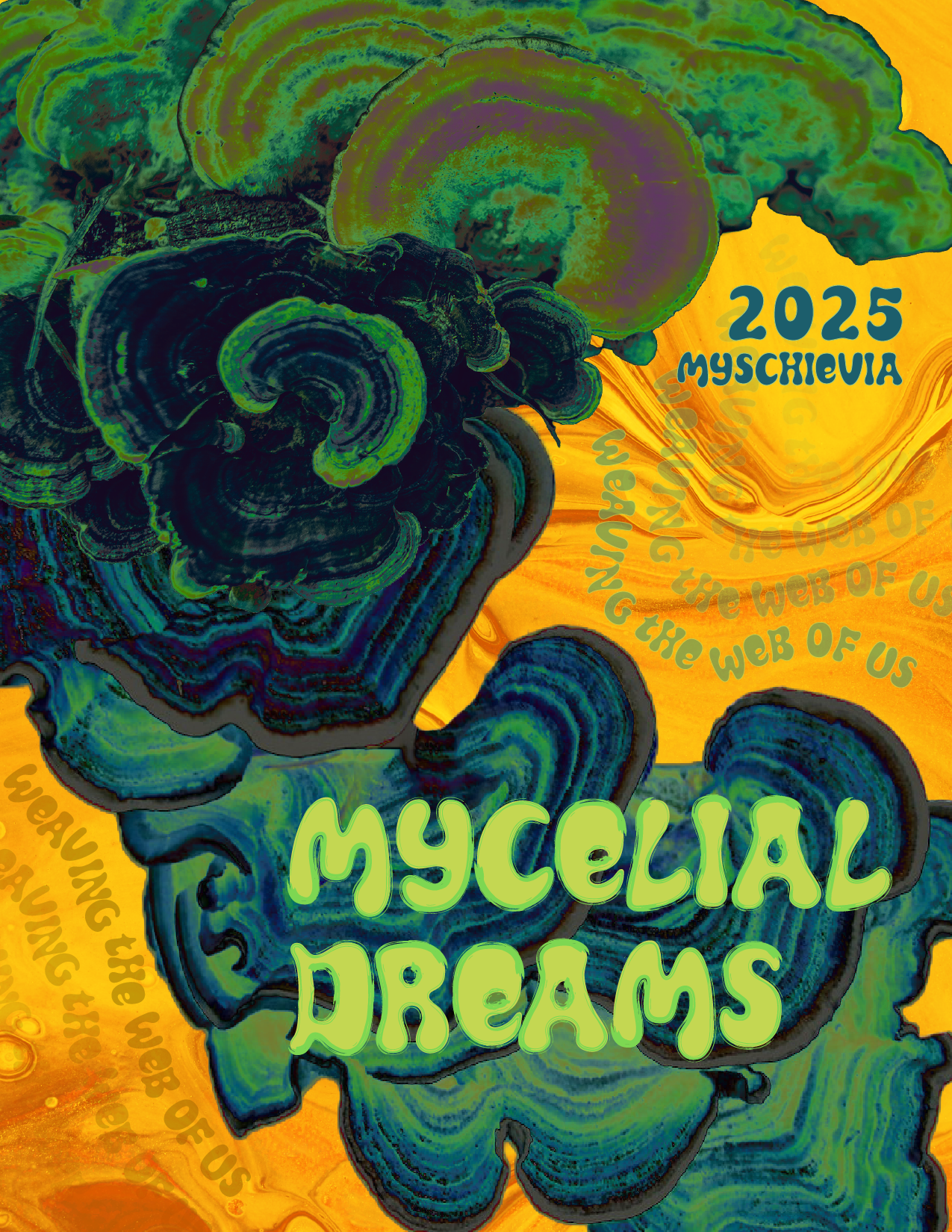
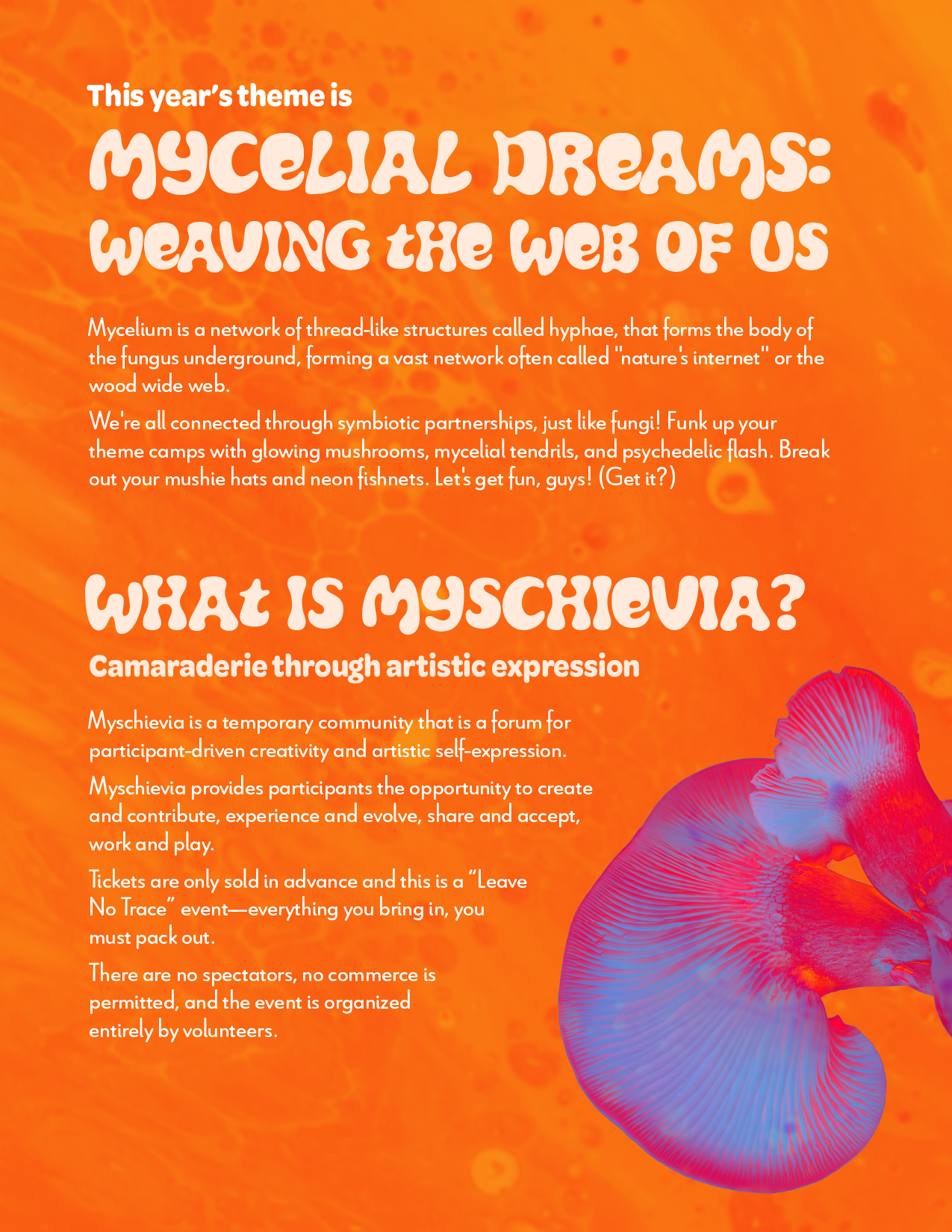
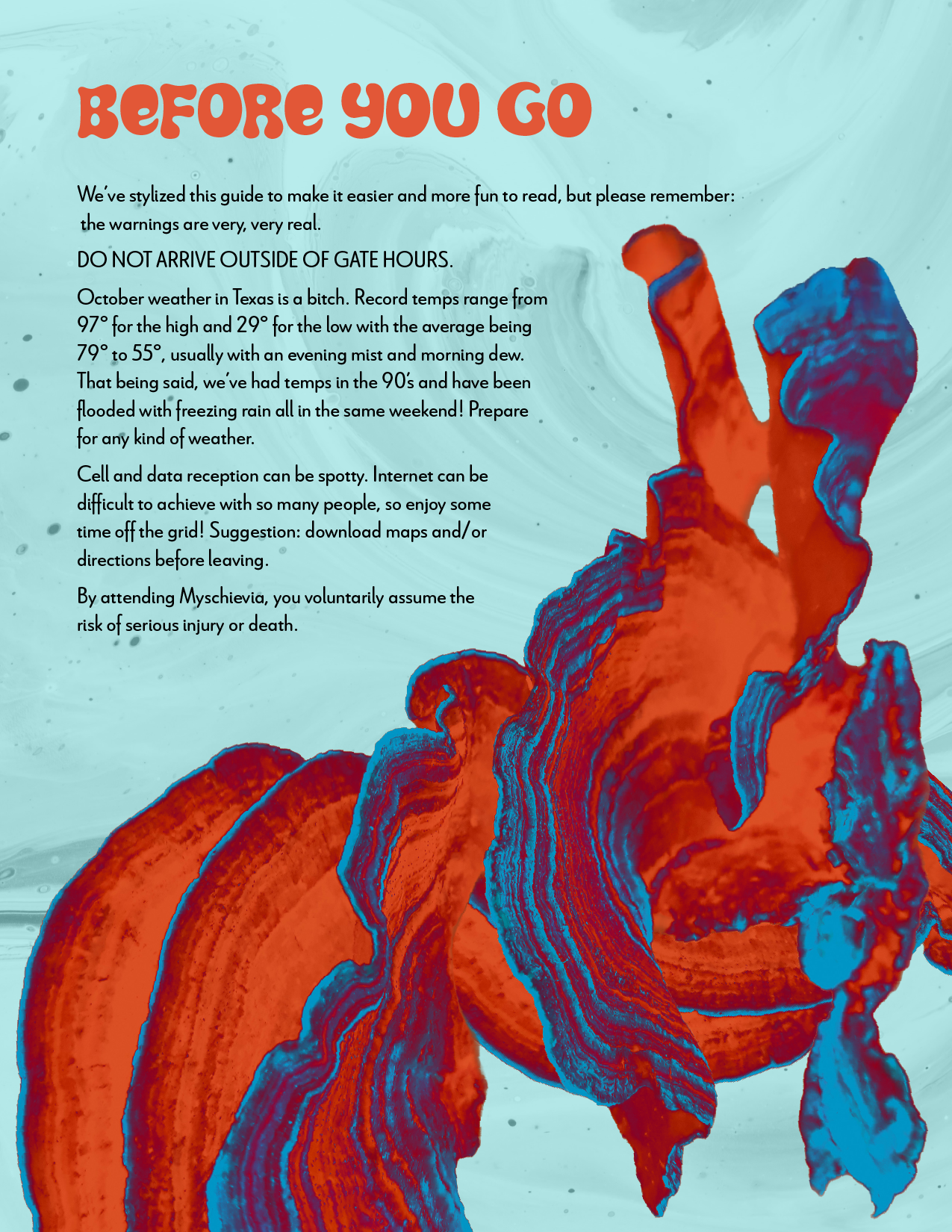
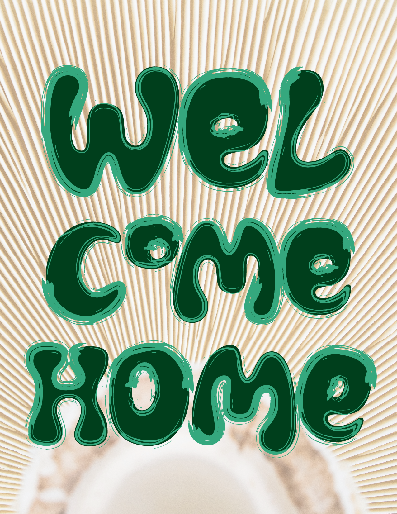
Myschievia 2025: Mycelial Dreams
Mushrooms and the 1970s share a certain visual language: organic, fluid, a little unhinged. The concept leans into that overlap, letting the forms melt and groove together into something that feels alive.
The survival guide
I did the imagery, font choices, color palette, and book layout.
The wristband
The wristband design extends the organic, textural blend into a physical touch point, bringing the melting, groovy world off the page and onto the wrist.

